In an effort to get more immersed in the art community, I’ve started going to life drawing sessions. These sessions have no instructors, you just leave your $5 at the door and enter an artfully-lit room full of people sketching away in front of a live model. The cool thing is that the sessions push you to work quickly and don’t give you much time to criticise your work. The first time I was there, the model started with a series of 2 minute poses that left me scrambling to figure out where to start. In an effort not to freeze up and feel intimidated I decided to just concentrate on blocking out the main torso area. It was a little awkward at first, then you started to get into the flow and slowly lose the self consciousness.
These were some of my first attempts:
-

-
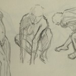
Oh my, what is this?
-
-
That’s a start.
-

-
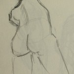
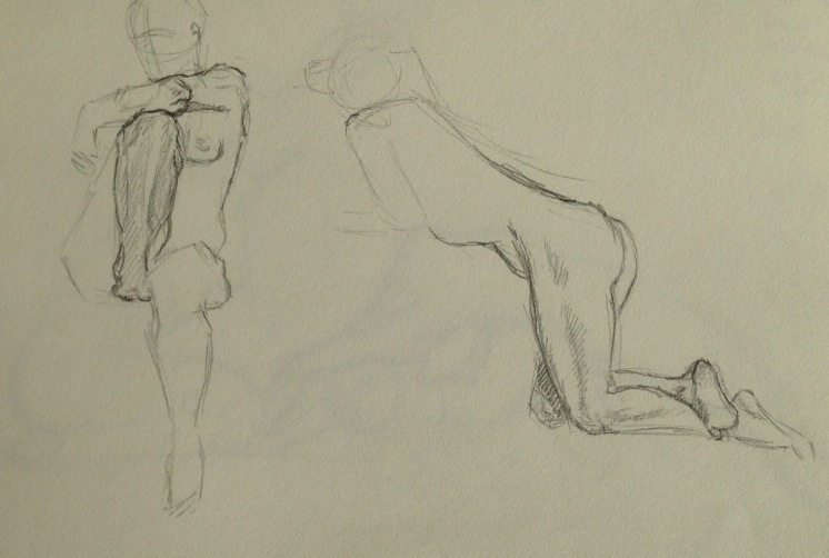
Was in a bit of trouble here!
Turns out these quickies are a pretty fantastic way to warm up and the speed with which you have to work helps you stop drawing in those furry little strokes that tend to happen when you are being to precious about things. After a while the model moves onto some longer poses that give you more time to explore and hone your style and technique. By the end of the first session I was actually pretty pleased with how comfortable I was getting. I was able to find enough spare braincells to start bringing out aspects of the picture that were interesting to me. (I don’t know how exactly to describe it but I really enjoyed empathising on the weight/balance/grounded-ness of a figure.)
-
-
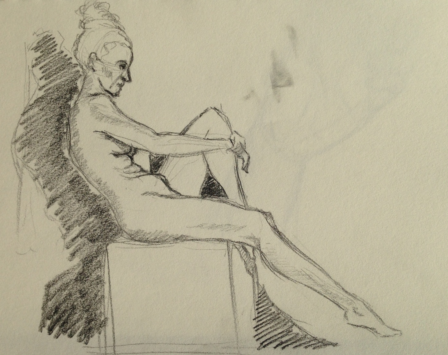
5min poses give some extra time to flesh things out
-

-
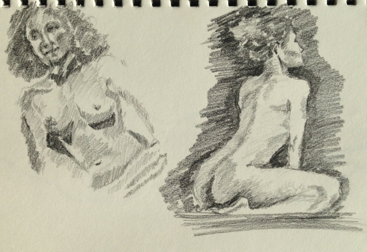
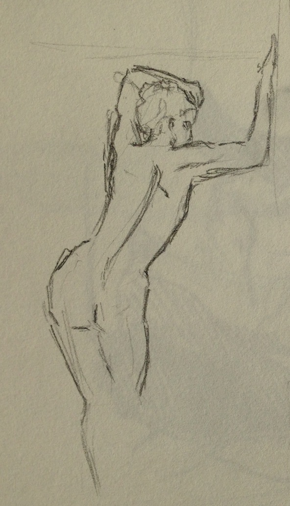
I think these were 15min ones?
-

-
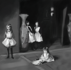
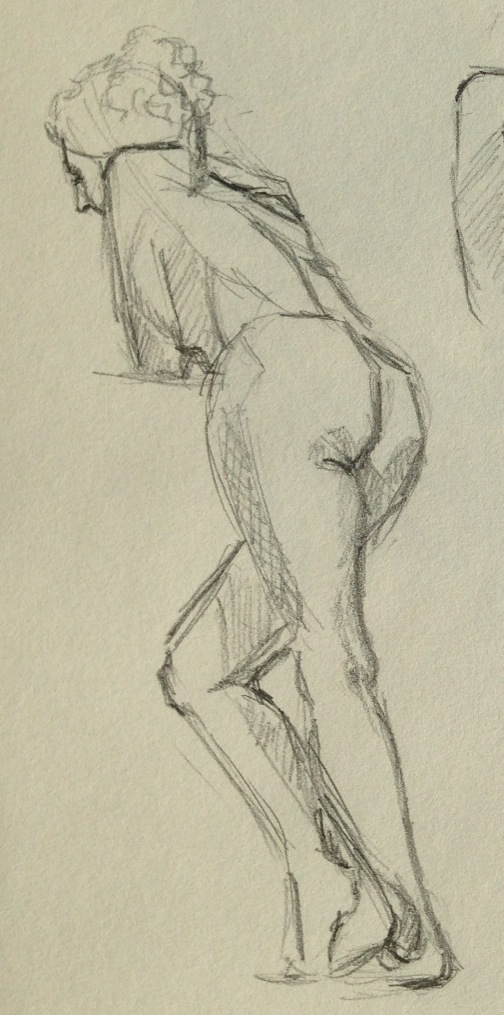
Felt like some progress being made 🙂
A few sessions later, my friends and I were throwing mini challenges for each other. For example, draw the next pose without lifting your pencil off the paper (again, helping to minimise those furry lines).
The body was done as a single line. Gave up at the head haha.
Another challenge was to do away with lines and concentrate on the tone.
The experiments don’t always work out but it keeps things fun and I think does help you learn faster. One thing I’ve been trying to do is to take more risks. When you always play safe and aim to produce perfect/pleasing work all the time, you often miss out on the opportunity to learn laterally. It seems true in a lot of contexts that some things have to get worse before they get better.
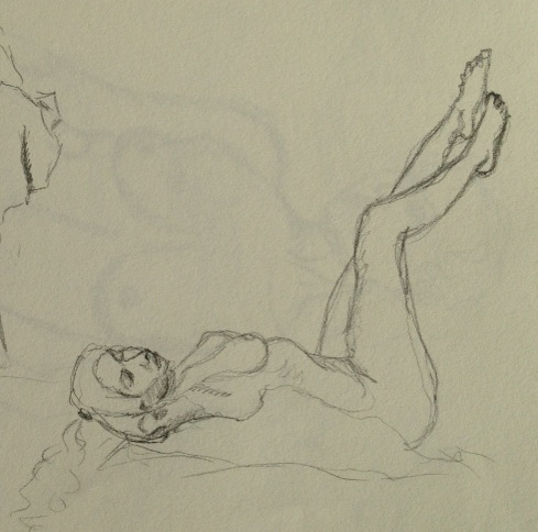
Other strats for making progress: Focusing on one area at a time. Each model is different and sometimes it’s more fun to concentrate on something that is unique to the model. For example, week 1’s model was curvy and it was fun studying tone on her back and belly. In contrast, week 2’s model was lean, long-limbed and flexible, spent most of the time studying her legs.
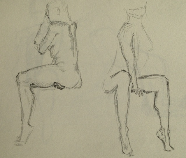
Week 3’s model had amazing ways of angling her hips and shifting her weight around. In the words of a friend “she’s like a freaking greek statue!” (Dynamic was a word of praise I heard thrown around a lot by the other people in the session.)
I’ve really enjoyed these sessions so far. Apart from expanding my skills and giving me a newfound confidence for capturing the moment, they are also very soothing. You are able to cast all your thoughts away and just focus on the task at hand. Later you can go back, reflect on your progress and make plans for what you want to practice next session.
So that’s something new I’ve been trying. What about you guys? Anything new obsessions?