Personal notes after reflecting on lectures from conceptart.org (May add to this later):
Composition is all about creating focus.
Create focus by balancing emphasis & economy
- What are your points of interest?
- Points of interest should help the eye move around the canvas. (Feels dynamic, interesting and believable).
- Levels of Emphasis – Primary, secondary, tertiary…
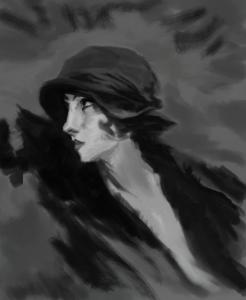
- How to direct attention? The presence of contrast strengthens emphasis. Contrasting values, colours, directions, ideas/poses/actions.
If most of the picture is uniform and then you have even a small point of difference, that point of difference is very noticeable. Strong focus point.
Other things that pull emphasis:
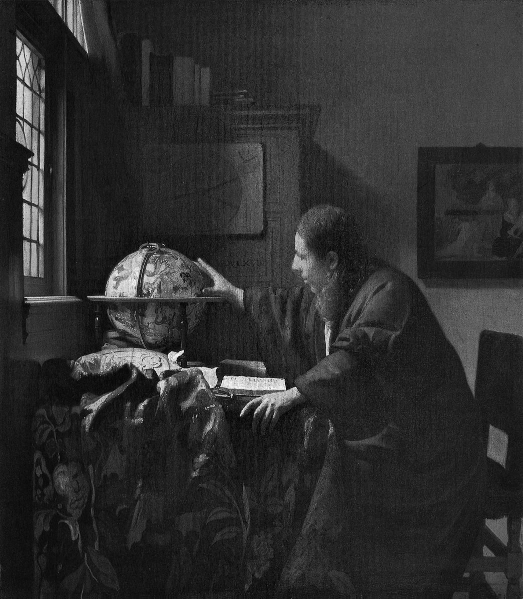
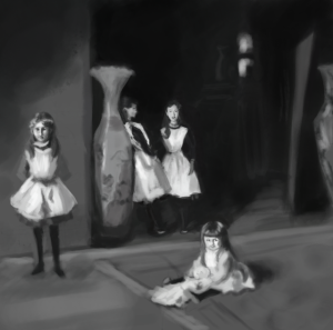
- Social proofing – People in the scene looking in a direction. Faces in general draw attention.
- Amount of detail, soft and blurry backdrop
- Front to back?
Rhythm
- A loose pattern with some uniformity and some chaos. The human perception system is pretty geared towards recognising patterns, it really draws the attention.
- There can be rhythm in many things: placement, colour, shape. (Think about gestalt principles).
Repetition
- Works with Rhythm and is a way to introduce more points of interest.
Variety
- Increases organic feel of the scene. Believability.
- Or it will feel stagnant, although it will feel stately, controlled and safe? Mechanical…? Or make things feel uncanny and creepy.
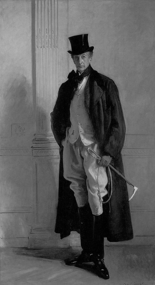
Continuity – Implied Lines
- Draw the eye along implied lines. Diagonals look more dynamic. horizontals look safe.
Balance
- Balance detail and calmness throughout the painting.
- Weigh your visual weights. Is your emphasis heavy enough on your areas of interest?
- If not careful, composition will feel heavy on one side. Or the hierarchy will feel off.
- Opposing points of interest feels a connection. (could be diagonal, point symmetry).
- Divide and conquer – Can divide into quadrants or thirds and analyse, is it balanced enough?