Thumbnail Studies – Colour

Starting to do some colour studies. I was doing backgrounds for our Regency Love game and I felt like the bit I had most trouble with was working out a good colour pallet. The colours either were a bit too saturated or they started to look muddy when I mixed them too much. Then often I couldn’t get the mood right, like it was too blue/green when it was supposed to have a warm feel.

Hence, thumbnail studies, concentrating on getting the general colour and atmosphere right. Found it quite challenging but useful!

Bierstadt – Praires
Orlovsky – Spring Day Ukraine

1_Thumbnails

Going Digital – Brushes, textures and colours

Playing around with water colour has been interesting so far. Getting the colour you’re after can be a bit of a challenge. I had to do a lot of experimenting with mixing colours before I could get effect even close to what I was going for. Sometimes, mistakes and surprises can actually create a nice effect.  

WaterColour3

WaterColour2

Eventually though, I’d like to take what I’ve learnt through the traditional media and apply it to digital art. Erm… Easier said than done. Floundering so much X_x

TreesAndBrushes

So here I am repeatedly trying to recreate the effect (in spirit) on the brown-ish tree (bottom-middle) of the water colour image. Hmmm… After a while I semi-gave up and started playing with other styles. The water colour was definitely a source of inspiration but I’m not sure I can or even want to exactly replicate that water colour effect in the digital versions. While I was experimenting though, I encountered some interesting lessons.

Two things I learnt:

  • Colour is tricky in digital art because you have TOO many choices. In traditional media, your pallet is sort of limited by which colours you start out with and how you mix them. Having a limited pallet keeps a cap on your choices and helps keep all the parts of the image in harmony. When you’re doing digital stuff though, you can go choose as many garish hyper-saturated colours as you want. Sometimes it works if you want particularly bright statement effects but a lot of the time, you end up shooting yourself in the foot with careless choices. I’ve been following some interesting guides on how to keep your colours scheme sane.
  • Texture is also tricky. Custom brushes are amazing for getting that elusive texture but I often get carried away, resulting in a mess of brush stamps. I hope to get a better feel for it in time. For the moment, blocking out the general shape out first reminds me of what I’m actually trying to represent.


TreesAndBrushes2

There are lots of downloadable brushes by awesome artists to help get one started. I’ve been picking and choosing my way through the sea of options. Drowning slightly but very grateful for the variety of resources out there. Phew…

http://feohria.deviantart.com/art/About-Digital-Painting-Brushes-Photoshop-349926721

http://www.sycra.net/

http://god-head.deviantart.com/art/13-Blending-and-Texturing-Brushes-334496963


Colour Harmonies – Analogous Colours

Analogous colours are a set of colours that sit next to each other on the colour wheel. Images and designs using analogous colour schemes are usually easy on the eye, coming across as natural and somewhat mild.

While reading Colour Harmonies by Rose Eding and Dee Jepson. I came across the technique of using a set of analogous colours in place of a single (local) colour to create more interesting and dynamic effects.

So, instead of painting a tree different shades of green to represent the light and shade, you can use the colours beside it on the colour wheel, blue and yellow. Layer the blue as shadow and yellow as highlights. Allow them to run into each other naturally on the paper.

In the end green will still be the dominant colour perceived but having the yellow/blue highlights peaking out creates quite an eye catching effect. I played around with a couple of examples, here are the results. The local colour version is on the left, the colour harmony version on the right.

Blue and yellow in place of green.

Red and yellow in place of orange.

Blue and red in place of purple.

What do you think of the effect? Perhaps it’s not everyone’s cup of tea but what kind of feeling does it leave you with? Do you prefer the local colour version or the analogous colours version?

Note, the experiments focus on the secondary colours – green, orange and purple. I tried a few with primaries. I don’t think it works in the same way since you can’t combine two secondaries to make a primary colour. Things just ended up looking a little messy.


Colours!

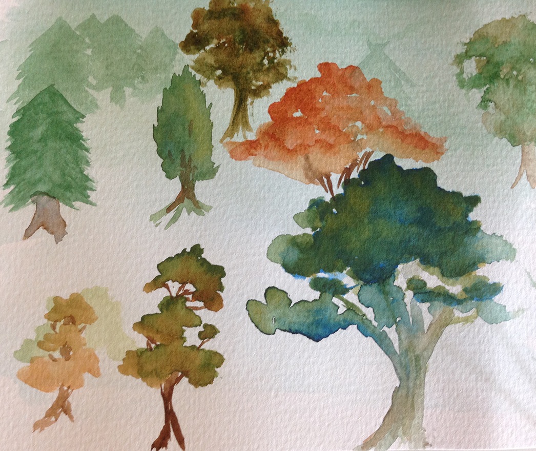
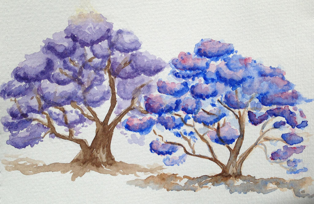
I recently started doing some painting with watercolour. The aim was to get back to basics with traditional media in order to get some fresh inspiration for all this digital illustration/design stuff.

While experimenting, I was paying particular attention to colour; how to get a specific colour, what to expect when mixing colours, how to assemble a colour scheme that is harmonious and conveys the right mood. Sometimes, I can get the effect I want through trial and error but I find that it often leads to a lot of muddy concoctions. It’s always helpful to have a system.

Warm and Cool Primaries

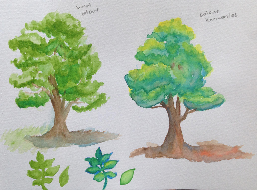
A useful way to think about colour is in terms of warmth and coolness. It goes beyond classifying certain colours as warm (red, orange, yellow) and certain colours as cool (Blue, purple green). It’s a relative scale. So you can have a relatively warm blue (a purplish blue) or a cool yellow (a greenish yellow). A painting pallet will often include a warm and cool version of each primary colour. The watercolour starter kit I have includes the following colours:

Colour pallet

The kit also includes some other colours to help with creating earthy tones (these can be tricky to make from just the primaries). Not going to deal with how these browns fit into the system just yet but I’ll just post them up for completion’s sake:

Colour pallet

Making more colours

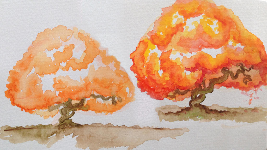
As in primary school, red and yellow make orange, yellow and blue make green, blue and red make purple. Having a warm and cool version of each gives you more control over the saturation of your colours. E.g. You can make a very vibrant green or a slightly earthier one depending on which combinations of warm and cool you use.


As a general rule, keep colours vibrant by combining colours that are closest to each other on the colour wheel, erm… rectangle. Colours next to each other are analogous. Colours opposite each other are complementary. More on this later.

Extras: