Going Digital – Brushes, textures and colours

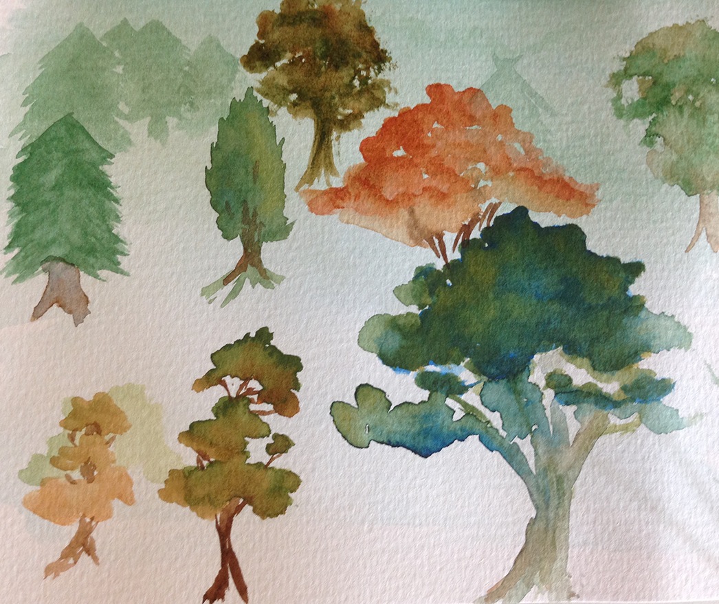
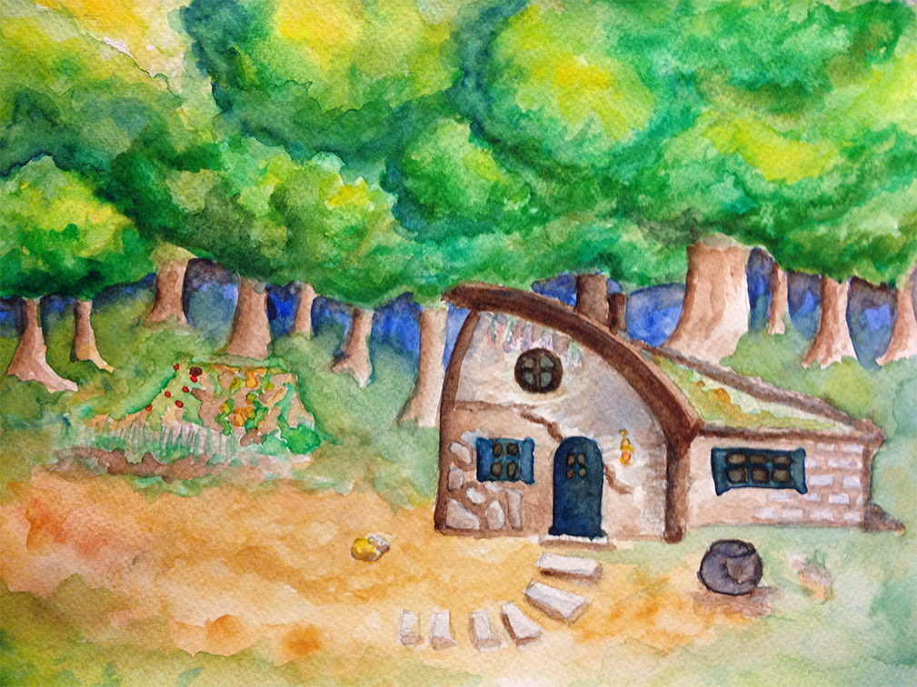
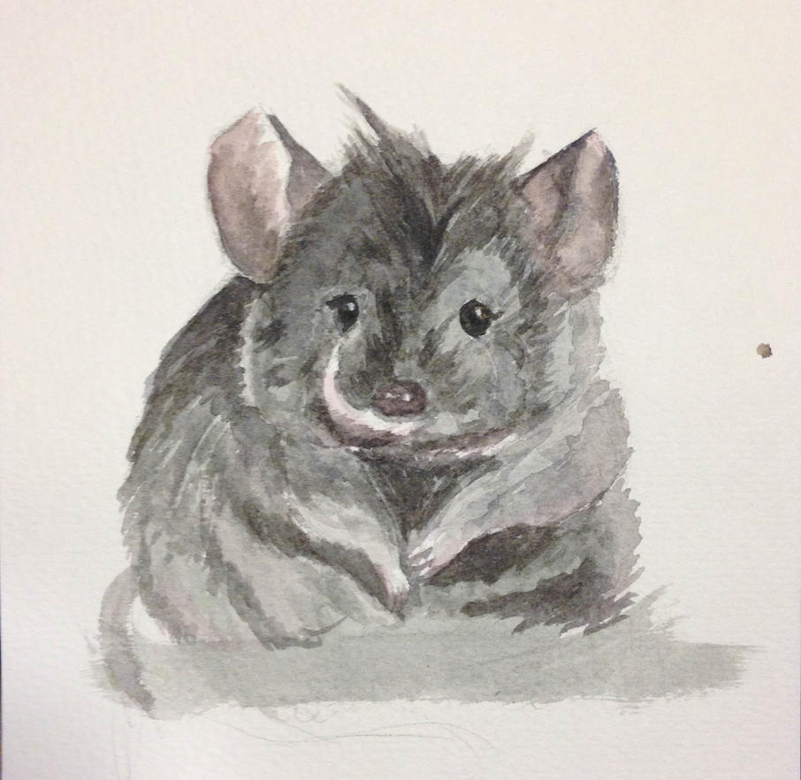
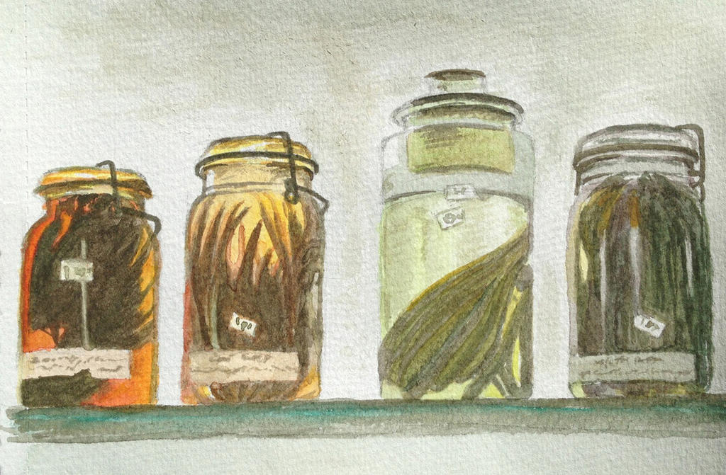
Playing around with water colour has been interesting so far. Getting the colour you’re after can be a bit of a challenge. I had to do a lot of experimenting with mixing colours before I could get effect even close to what I was going for. Sometimes, mistakes and surprises can actually create a nice effect.  

WaterColour3

WaterColour2

Eventually though, I’d like to take what I’ve learnt through the traditional media and apply it to digital art. Erm… Easier said than done. Floundering so much X_x

TreesAndBrushes

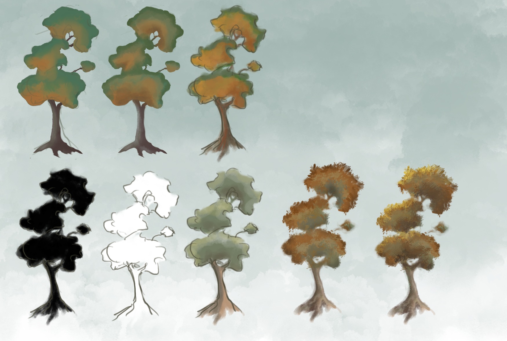
So here I am repeatedly trying to recreate the effect (in spirit) on the brown-ish tree (bottom-middle) of the water colour image. Hmmm… After a while I semi-gave up and started playing with other styles. The water colour was definitely a source of inspiration but I’m not sure I can or even want to exactly replicate that water colour effect in the digital versions. While I was experimenting though, I encountered some interesting lessons.

Two things I learnt:

  • Colour is tricky in digital art because you have TOO many choices. In traditional media, your pallet is sort of limited by which colours you start out with and how you mix them. Having a limited pallet keeps a cap on your choices and helps keep all the parts of the image in harmony. When you’re doing digital stuff though, you can go choose as many garish hyper-saturated colours as you want. Sometimes it works if you want particularly bright statement effects but a lot of the time, you end up shooting yourself in the foot with careless choices. I’ve been following some interesting guides on how to keep your colours scheme sane.
  • Texture is also tricky. Custom brushes are amazing for getting that elusive texture but I often get carried away, resulting in a mess of brush stamps. I hope to get a better feel for it in time. For the moment, blocking out the general shape out first reminds me of what I’m actually trying to represent.


TreesAndBrushes2

There are lots of downloadable brushes by awesome artists to help get one started. I’ve been picking and choosing my way through the sea of options. Drowning slightly but very grateful for the variety of resources out there. Phew…

http://feohria.deviantart.com/art/About-Digital-Painting-Brushes-Photoshop-349926721

http://www.sycra.net/

http://god-head.deviantart.com/art/13-Blending-and-Texturing-Brushes-334496963


Moving On From a Major Project – New Year Plans

Hello, I have been a terrible slacker and deserve to be on the wall of shame. Apologies for halting the chain! I was pretty burnt out after the release of Regency Love and took a proper break to catch up with some very neglected friends and  family. Thank you guys for all of your interest and support! It has really got us through some anxious days.

It’s a new year and I’m at one of those strange junctions in life so I thought I’d share a few thoughts, hopes and apprehensions. 

Currently, my main hang up revolves around whether I want to continue with Regency Love and how much effort do I want to dedicate to it in the coming year? Judging by the reviews and customer comments, we definitely have a good thing going but it’s no where near reaching its potential yet. Despite the overwhelmingly positive feedback, we are having a lot of trouble continuing to promote to our niche audience. Emailing online magazines and blogs is a time consuming and often emotionally draining task. Out writer has been holding the fort admirably on this front but I often feel bad that she’s probably not seeing results to justify her efforts. On the other hand, simpler payed advertising is consistent but terribly inefficient for a low cost mobile game. We have had some success building a following but we have a long way to go in terms of building a sustainable marketing model. 

This in itself would not be a problem for there are many business ideas and directions that we have barely explored. The problem is more a matter of time, commitment and enthusiasm. The project was born from our passion for story telling but now it feels like we’re just doing what needs to be done to get things released. I know it can’t all be fun and games but where do you find the energy to make long term plans when you’re even not sure that people are still enjoying the work? 

Both my colleagues were engaged in formal study while contributing to the game where as I was working on this full-time for almost a year. I felt rather unbalanced by the experience as I wasn’t sure if I was growing or learning much from coding and toying with the game design on my own. At the same time I wasn’t sure how dedicated I could expect my team to be since they all had other commitments. However, I have a history of starting projects that never get finished so I was determined to see this one through.

Now that I have “finished” the project, those fears of loosing steam are starting to be realised. I’m not sure how I want to continue. We are thinking of going on hiatus and placing Tea For Three Studios work on the back bench as something we do for fun. I realise that this may mean Regency Love will never get the exposure it deserves and my colleagues and I may grow apart as a team. On the other hand, perhaps a break is exactly what we need. We can go and grow as individuals while retaining our contact with each other and maybe we’ll regroup at a later time with a bit more experience.

I know many of you guys are trying to create your own products and start your own businesses. What keeps you going on a project? When do you pull away and move on? Do you have any regrets?

My aim for the new year is to grow independently of Tea For Three Studios and be less of a hermit. I am going to go study game art at AIE. I hope to develop some new skills while meeting lots of people in the industry. Peggy and I are going to Game Jam! Another effort to get over introversion and work with cool new people. 

Holiday season: Mel spends time away from the computer. Still messing around with water colours.


Regency Love – Sprint to Release

Hello guys, this poison post is going to be a shameless plug.

I have been trying to use these poison post deadlines as a motivator for exploring things that are not directly relevant “work”. However, these past few weeks I really have been head-down working on Regency Love with little time for anything else constructive (procrastinating and floundering not counting as constructive!). Since the project has played a really big part in shaping my learning as well as my sleeping patterns this past year, I thought it only fair to tell a short story about it.

Early Regency Love Concepts

Early regency love concepts

Regency Love is a romance game inspired by the novels of Jane Austen. The project has been incubating, evolving, hibernating and reviving for the better part of two years now. It started off as a hopeful collaboration between a writer, artist and programmer who were obsessed with Dragon Age, not because of the dramatic battle scenarios or nifty tech trees, but because of the romance-able party members. We wanted to make a game with romance at its core.

Period romances have always been popular in movies and TV dramas but never so much in games. We were very taken with the idea of creating an interactive experience, centred around life as a Regency lady, Jane Austen style. We were also somewhat confident that we would have an audience who felt the same.

So, with little experience and a lot of blind determination, we muddled our way through, doing what we could with game design, development and marketing. We’ve actually started to get the hang of some things, like running play-tests. Gathering busy volunteers, getting their feedback in time for next sprint and wading through Apple’s provisioning admin procedures were some of the things we didn’t even know would be hard until we tried to do it. Between TestFlight, Wufoo forms, and a dropbox full of pre-prepared instruction and thank you emails, running our last play test was almost painless.

Still, this is only the beginning. We will be releasing the game in a month or so and I am hoping we won’t loose steam after the initial release for that would be cutting the journey short. After all that research on app store marketing and hoarding of potential PR contacts, we’re finally going to get the chance to try things out for ourselves. It will be interesting to see what works for us. Many of you have been sending me great articles on related games and app store strategies. I really appreciate it, thanks very much for all the leads.

Follow us at Tea For Three Studios if you’re curious. We could certainly do with your support. If you know of anyone who might be interested in this genre of gaming please pass the word on.


Colour Harmonies – Analogous Colours

Analogous colours are a set of colours that sit next to each other on the colour wheel. Images and designs using analogous colour schemes are usually easy on the eye, coming across as natural and somewhat mild.

While reading Colour Harmonies by Rose Eding and Dee Jepson. I came across the technique of using a set of analogous colours in place of a single (local) colour to create more interesting and dynamic effects.

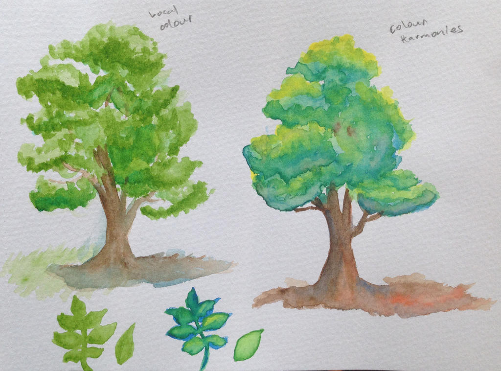
So, instead of painting a tree different shades of green to represent the light and shade, you can use the colours beside it on the colour wheel, blue and yellow. Layer the blue as shadow and yellow as highlights. Allow them to run into each other naturally on the paper.

In the end green will still be the dominant colour perceived but having the yellow/blue highlights peaking out creates quite an eye catching effect. I played around with a couple of examples, here are the results. The local colour version is on the left, the colour harmony version on the right.

Blue and yellow in place of green.

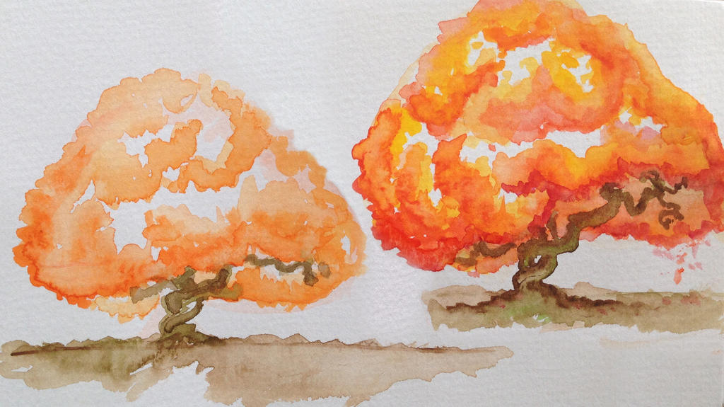
Red and yellow in place of orange.

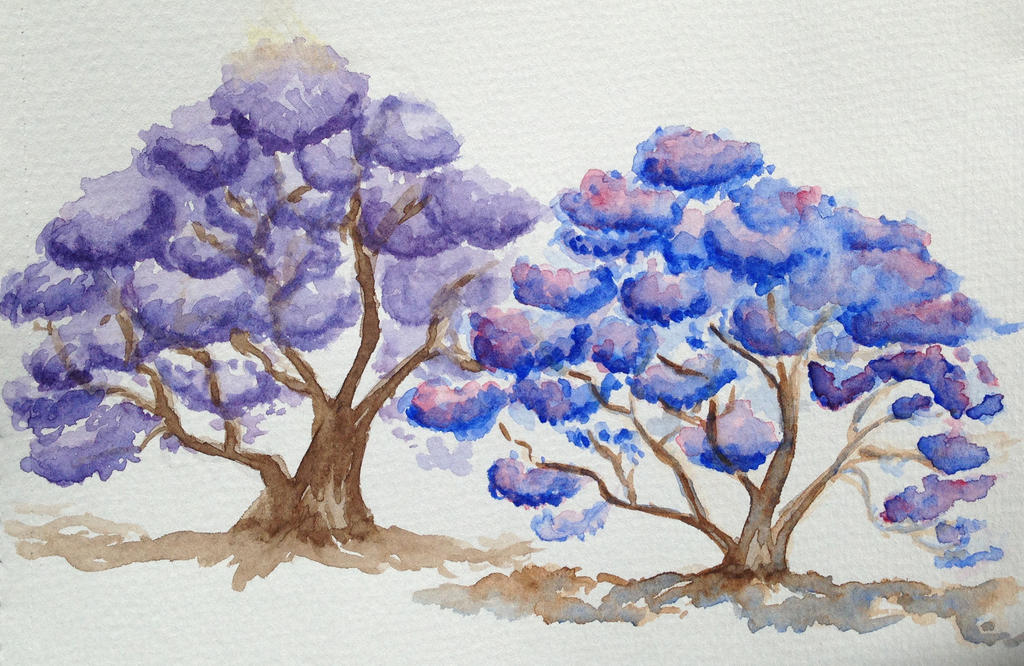
Blue and red in place of purple.

What do you think of the effect? Perhaps it’s not everyone’s cup of tea but what kind of feeling does it leave you with? Do you prefer the local colour version or the analogous colours version?

Note, the experiments focus on the secondary colours – green, orange and purple. I tried a few with primaries. I don’t think it works in the same way since you can’t combine two secondaries to make a primary colour. Things just ended up looking a little messy.


Colours!

I recently started doing some painting with watercolour. The aim was to get back to basics with traditional media in order to get some fresh inspiration for all this digital illustration/design stuff.

While experimenting, I was paying particular attention to colour; how to get a specific colour, what to expect when mixing colours, how to assemble a colour scheme that is harmonious and conveys the right mood. Sometimes, I can get the effect I want through trial and error but I find that it often leads to a lot of muddy concoctions. It’s always helpful to have a system.

Warm and Cool Primaries

A useful way to think about colour is in terms of warmth and coolness. It goes beyond classifying certain colours as warm (red, orange, yellow) and certain colours as cool (Blue, purple green). It’s a relative scale. So you can have a relatively warm blue (a purplish blue) or a cool yellow (a greenish yellow). A painting pallet will often include a warm and cool version of each primary colour. The watercolour starter kit I have includes the following colours:

Colour pallet

The kit also includes some other colours to help with creating earthy tones (these can be tricky to make from just the primaries). Not going to deal with how these browns fit into the system just yet but I’ll just post them up for completion’s sake:

Colour pallet

Making more colours

As in primary school, red and yellow make orange, yellow and blue make green, blue and red make purple. Having a warm and cool version of each gives you more control over the saturation of your colours. E.g. You can make a very vibrant green or a slightly earthier one depending on which combinations of warm and cool you use.


As a general rule, keep colours vibrant by combining colours that are closest to each other on the colour wheel, erm… rectangle. Colours next to each other are analogous. Colours opposite each other are complementary. More on this later.

Extras:


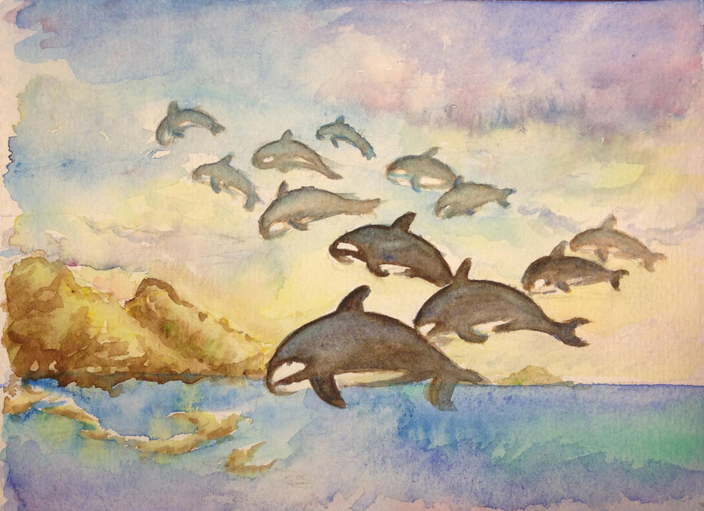
Flying Orca Herd

I wish!

Mel goes nuts with colour. Using layers of colour directly from the pallet rather than mixing them before hand. Causes lots of interesting and unexpected effects.

Visual Interface Practice – eBook Library

Since we started our poison blogs, I’ve been making an effort to gain a level up in visual design skills. One of my bald spots is typography. This is an area I’ve never had any intuition for… As a kid my handwriting was pretty horrid and it hasn’t really improved much since. I think the latent SHAME might be part of the reason I’ve generally avoided thinking about text and form together.

As a step towards rehabilitation 😛 I have been working through Designing with type – The Essential Guide to Typography by Craig, Scala and Bevington. It’s organised like a textbook so it works well as an introduction. I’m only about a quarter of the way through but I feel like it’s time to break things up with a mini project.

A visual interface for eBooker

This continues from the last post on eBooker UI. eBooker is a project Min’an was working on a some time ago. For more background info see the original post. This isn’t meant to be a pure typography project but hopefully I’ll be able to put some new knowledge to use.

Typography can get overwhelming. There are so many choices with such subtle variations that it’s quite tricky to figure out where to start. Whenever I’ve tried to make font choices in the past I just find myself constantly going back and forth comparing one to another. So to avoid drowning in choices, I’m going to limit myself to considering a few fonts for now. Designing with Type has a Chapter early on about five classic fonts which I’m going to use as an anchor. 

Garamond – Old style

Baskerville – Transitional style

Bodoni – Modern style

Century Expanded – Slab serif /Egyptian style

Helvetica – Sans serif style

Each was developed at a different time (Garamond as early as the 1600s) and it’s pretty cool to see how the iconic styles evolved. For example, Garamond was created when the paper and printing technologies were still quite primitive. The strokes are relatively thick and it looks kind of flowy due to its sloping serifs.

In contrast, when Bodoni was created, improved paper and printing technologies meant that there could be more contrast between thick and thin strokes. The resulting look is very sleek and dramatic.

If you’re curious, this article summarises the story of these classic fonts quite well. There is also a neat little eBook on the basics of typography with all the jargon explained in a fun and cheeky way.


The Results

A note on names: I thought it was odd that eBooker sounded more like an app that helps you make bookings than something to do with books. I quite liked Calibre’s name in that it doesn’t have anything to do with books necessarily but it’s still quite memorable and has the right feel to it. So, while doing the designs I also rounded up a few alternative names.

Brainstorm results – Type, colour and concepts.

More fleshed out VI designs

The interface was fleshed out using the wireframes from the previous post as a base. I spent most of the time playing with alternative looks and layouts and didn’t get a chance to do a complete set of screens. There are still lots of things bothering me about these attempts but no point being a perfectionist now. Hoping that when I look back on this after a few more months I will be able to see why certain things look a bit off.