Fellow poison blogger, Min’an (a.k.a. Potato-Y) recently devised a neat little regime for fending off perfectionist traps. The idea is to focus on one discrete project a fortnight, rapidly experimenting, building and learning. Then when the fortnight is up it’s time to move on, leaving all thoughts of enhancements and bug-weeding behind.
Last fortnight was spent working on eBooker, a web based ebook library. The results of his experiment can be seen in this show and tell post. At the same time, I was happily piggy backing off this project and approached the same problem from a user centred design perspective.
My idea of user research was lurking around on forums eavesdropping on Calibre users as well as having informal chats with friends and family who have an interest in eBook collections. All in all, a very hacky process but it still yielded some interesting insights. Here’s a summary along with bits and pieces of the mockups:
Recents and Favourites
People only attend to a small number of books at a time. These tend to half-read books and frequently used reference books. These should be easily accessible and not embedded in any deep hierarchies of organisation.
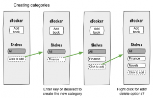
Custom Categories
Custom categories reflect the user’s individual interest areas. It allows people to organise their books by context of use (such as work or hobby). This often supports the workflow better than the less personal author, publisher or even genre tags.
E.g. One user’s categories looked something like: Finance, Go (wei qi) instruction books, popular novels and technical reference books. The categories aren’t very uniform, Go is a much more specific category than popular novels, but they work for this individual. So long as these categories are few in number, manually managing them should be a satisfying rather than frustrating experience.
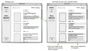
Metadata
When Min’an and I were bouncing some ideas at the beginning, we were puting a fair bit of thought into ways to populate metadata. It was an interesting technical problem with lots of hairy bits which made it interesting to think about. However, after chatting with a few potential users, it became apparent that having easy access to a book’s metadata is more important when you’re considering purchasing a book and not so much when the book is already in your collection.
Having said that, the group that I chatted to were older and tended to have smaller collections. To get a different perspective, I had a quick google online about how people managed their eBook colletions. Stumbled across these guys http://www.heroesandheartbreakers.com/blogs/2012/04/kindle-magic-or-how-to-organize-your-kindle-library, wow, they are keeping collections numbering in the thousands. Now that feels like a very different use case the the one I’d been thinking about. If the user is searching for a specific book amongst thousands, complete metadata becomes a whole lot more important.
Searching versus Browsing
This depends on how many items you have in your library and how frequently you need to access them.
For small collections, people prefer to browse rather than search. Chances are, the user knows their modest collection fairly well and would prefer to scan and locate a book by recognition rather than make the effort to recall a title/author and type a keyword.
For very large collections on the otherhand, searching is a much appreciated perk of having an digital collection.
Regardless of library size, users still only regularly access a small subset of their collection at a time. For these recent or favourite items, browsing may still be prefered over searching.
Browsing for fun
Browsing a library for no particular purpose is an enjoyable pastime. People aren’t always trying to search for a specific book. Sometimes they just enjoy thumbing through a collection of inspiration under a subject of interest. It’s not all about efficiency. This is where having complete metadata makes the experience more pleasant.
Quick flipping
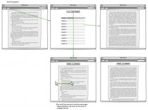
This is more to do with reading than organising but there is a frustrating thing with eBooks where you don’t necesarily read from beginning to end. Reference books and textbooks are a pain to use in digital format because quickly getting from one section to another requires so much effort. You either have to bring up a menu to jump to a section or bookmark (which breaks your flow and distracts you from the content) or thumb/click/scroll through the pages until you get to where you want (tedious repeated physical actions).
When I have a physical text book, I can quickly shuffle through the pages until I roughly get to the section I’m interested in, then flip more slowly to hone in on the specific page I want. What I like is that it gets me to places quickly yet it doesn’t break my train of thought.
In Hindsight
- Trying to do a UI process backwards is tricky. The project started out as a motivator for building an interesting tool from a technical point of view. Trying to then turn that project into something with a real user need felt like a bit of fakery at times… Still with some patchy research and a bit of intuition there was enough to go on make some interesting design choices.
- Working on the usability and the visual interface aspects at the same time slowed down progress. I refer to usability as designing an interface to support user goals, context and workflow. In contrast, visual design involves looking more at the aesthetic elements. Doing these in tandem required a lot of hat switching which was distracting. Sometimes I’d make a decision based on user workflow but then other times I would feel compelled to put something in because I could see a nice way to style it later. Going forwards, I’m going to make more of a conscious effort to separate the two. For this project I’ll post up my visual interface experiments separately.
- Lurking around on forums/blogs was surprisingly useful for open ended user research. It’s not particularly efficient and won’t answer specific questions but you can learn a lot while trawling through complaints and rants!
- Limitations of static wire framing. I found very it difficult to convey a design that involves a bit of movement, like pages flipping as you hover your cursor across the screen, with static images. I would really like to try some more interactive mockups later.
Tools
- Omnigraffle for wireframes. Template from https://www.graffletopia.com/stencils/459. Love the sketchy look of the template.


Nice! Love the mockups, might steal a few of them when working on it next time. I get the difficulty of trying to work backwards from a solution to a problem. Definitely open to working in the other direction if you’ve got some problems you want to approach from the beginning.
I really like the idea of books viewed recently, it’s actually something that Plex already has – http://forum.xbmc.org/showthread.php?tid=157725 (just for the picture, the recently viewed ones are “on deck”, also like how they tell you how far you are through the movie). I’m a big fan of their web interface and how they approach editing, i think it’s definitely worth a play around with if you haven’t done so already.
Custom categories or what sounds like tags was something I was thinking of squeezing in but cut out due to the complexity involved. It’s probably one of the first few things I would add if I touched it again. One of the ideas I thought of early on was to make use of metadata retrieval to automatically add custom categories or tags, along with book ratings since Amazon already categorises books, but again, too complicated 😛
The idea of book-flipping is intriguing and might actually be technically possible because the manipulation is actually done on the client side. I’ve never been a big fan of reading online because of the sheer speed and flexibility of browsing at the speed you want. A design for a totally new UI component?
As to mockups, Marty loves balsamiq, a quick google of what’s availble turned up things like this which might be useful
Looking forward to the visual interface experiments! 🙂
Hey! Thanks for the feedback. “On Deck” is a nice way to represent recently viewed stuff. I was toying with the idea of a quick shelf which was supposed to be the equivalent of you leaving a book lying open on the table cause you plan to come back to it tomorrow. Only, whenever I do this I just get a pile of books, all open and sitting on top of each other. So I wasn’t sure if that real life metaphor was a good one or just allowed you to get yourself into a mess. I’m guessing Flex’s deck cleans up after itself by gradually removing old items. That’s what I was going for when I put in sort-by-recent, but it would be nice to have a special named area for it.
Thanks for the interactive mockup suggestions, JustInMind has some nice things going on. I used to be a Balsamiq fan too (really like that they keep to a simple sketchy look) but I only find it useful when using mostly standard app/web elements. If I’m trying to explore something unusual (like that hover-page-flipping-thing I was trying to describe rather unsuccessfully), mockup tools tend to make things harder rather than easier.
I was actually thinking of something more generic like keynote or perhaps prezi. I’d also like to see what animation or rapid prototyping tools I can find. I’d like to spend some time on js with all it’s related tools and maybe even have a look at some simple game engines.
I’ll let you know when I have a good project idea for PAF.
I’m not sure if the deck cleans itself out, but it limits the maximum shown in a screen and paginates which reduces clutter somewhat.
Javascript’s not too bad for quickly prototyping stuff, but there are alot of tools available 🙂 Where game engines are concerned, I wouldn’t be surprised if there were full fledged ones around, particularly with the popularity of NodeJS. Joe and Peggy may have heard of some you can play around with.