Tools for the designer

Something I’ve learnt from the Unity community: Don’t build a game. Instead build a tasty platter of tools for a game designer.

Even in a small team, where you’re wearing both designer and developer hats, it’s helpful to have that split between activities. When you’re creating the tools, you want to focus on building something sturdy and extensible. On the other hand, when you’re designing a game, you want to be free to just try things out, make changes quickly, and focus on crafting an experience for the player.

I’m currently trying to take this approach, building small modules that can be plugged together easily. It’s great for motivation and general sanity (especially when you’re working in fits and starts). So far, I’ve started building a few small modules like a calendar, day cycle tracker, inventory, story/dialog, plant growth simulator etc. From this, I’ve started to gain a feel for how to structure and combine the modules. Leaving some notes here about the thought process so far:

Unity world space

Getting my head around unity world space and how it relates to screen size.

Unity Unit

The unit of measurement in unity. It is good practice to match 1 unit to 1 meter. Default physics and lighting systems are all tuned to this scale.
Tile mapKeep a scale of 1 tile = 1 unit, just for the sake of simplicity.

Camera

How much of your game is visible depends on:

  • Camera size
  • Aspect ratio of your platform’s resolution (e.g. monitor, phone, etc) 

ExampleIf you want your game’s viewport to include about 10m of your scene vertically (for a 2D game).
Camera size: 5 unitsMy scale: 1 unit = 1 meter

Pixels per Unit (PPU)

This is a property of a unity Sprite. Specifies how many pixels from your Sprite fit into a unit in the scene when the GameObject is scaled 1,1,1. 

Setting the right combinations

If you want to make sure all the sprites are the right size relative to each other and the same ‘sharpness’ no matter how far in/out you are zoomed, you should adhere to a consistent unit of measurement for your world. 
If you want to make sure images are sharp on a particular resolution, you need to make sure you have the right combination of these:

  • Object height
  • PPU
  • Camera size.

Example

  • Character height of 1.6m
  • Camera view height of 10m
  • Supporting resolution 2436 x 1125px

Required PPU (for this resolution) = 1125 / 10 = 112.5

Responsive game sizes

If you want to make a responsive game that works for multiple resolutions, you’ll have to decide on how you want to deal with the screen size changes. Say, if you have a bigger screen:

  • Do you see more of the world? 
    • Does this significantly change the game play?
  • Or is everything just enlarged? 
    • If everything is enlarged, then you have to make sure the resolution of your images is high enough to support your largest supported device.

To be continued…

Scene management

When learning a new system, I often get paralysed by thoughts about architecture and best practices. It’s a challenge not to fall into the over engineering hole. I’m supposed to be throw-away prototyping and dipping my toes in the water! What am I doing with 30 tabs open about modular Monobehaviours, scriptable objects, prefab best practices, the best way to organise your folders, and whether test-driven development is viable for games… Death.

At the beginning of this week, I was planning build a quick and dirty prototype of a plant growing simulator, which I’ve been mocking up on paper. Instead, so far I’ve spent most of the time setting up structures for scene and UI management. It sometimes seems a bit much but I have discovered that it is beneficial for my sanity (and hopefully future efficiency).

So, might as well post a bit about it.

This is what the set up looks like so far. The intention is to structure the scenes in a modular way, especially the UIs so that I can quickly try new scenes and layer them with existing interactive elements. Then, once I build a reusable scene, like a story dialog player, I can put that on top of whatever game world scene I’m currently experimenting with.

Now back to that plant growing simulator…

New journey into Unity

When we created Regency Love, I was most excited about making a deliciously immersive story experience. I wasn’t as concerned about the technology behind it so I decided to use whatever tool was most familiar to me at the time. That’s mostly how Regency Love ended up on iOS. As with all decisions, there were some perks and regrets.

The Apple ecosystem was booming at the time which gave us some good consistent exposure. We managed to attract a wonderful community of players, many of whom finding the game through their love of reading or period drama.

On the other hand, the biggest sadness was how terribly costly / time consuming it would be to port the game to any other platforms. Well, that and the fact that we’ve been wanting to go beyond the visual novel to experiment with more complex game mechanics, something that wasn’t exactly easy on a standard Cocoa development framework.

So, in the meagre amount of time I currently have outside my day job, I have been learning the ropes on Unity engine. I have a bunch of different game ideas I want to prototype, and I’m hoping to post a bit about my progress for reflection purposes. Reflection and a little memory augmentation, considering I will be dipping in and out of these new projects as time permits.

Here’s to learning new things!

Screenshot of Unity workspace.
Screenshot of my current Unity workspace. Lol the bugs…

Feet – bony bits, squidgy bits, blobby bits

A while ago I strained this muscle in my foot. It wasn’t one of those sudden, unbearable injuries. Instead, it was the kind that stuck around and crept up on you every time you worked your body a little harder than usual.

After ignoring it for months, I finally waddled to the physio and through the physio sessions, actually learnt quite a bit about how feet are very expressive of other things going on in the body. For instance, every time I tried to balance in a difficult position, my toes would panic and grab at floor. Also, learnt how the strain in my foot was connected to calf and butt muscles that were sleeping on the job and not doing their fair share of work. (A lot of injuries are caused by small muscles trying to do the work that big muscles are supposed to do. Another interesting discussion altogether).

In any case, it just got me thinking about how neglected feet are in general. Many people don’t give them much thought and some (like my friend from work) find them positively ugly. They get the shapeless blob treatment in art work quite a bit as well.

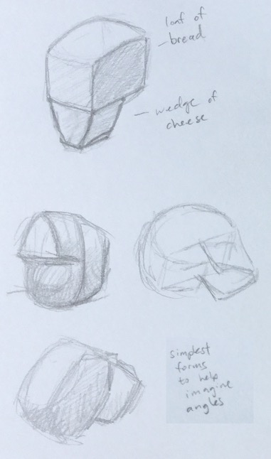
So I took the opportunity while rehab-ing to do a little study and observation, trying to understand something about the structure as well as the aesthetics of feet. 

Bits and bobs I found interesting:

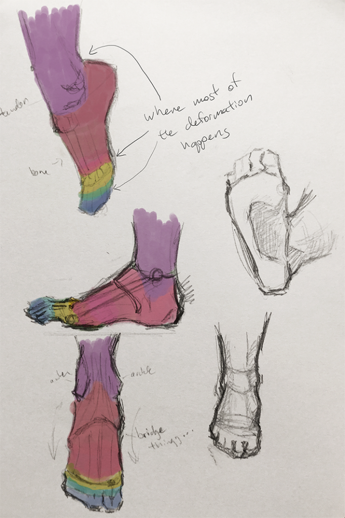
  • The arch of the feet almost reminds me of a slingshot. There’s the heel bone on one side and the toe bones on the other side and this springy line of muscle spanning them.
  • I’m purposely avoiding the medical terms cause I find inventing your own words for things makes it more memorable and fun (though squidgy bits, bony bits and blobby bits might be pushing it a bit).

Foot_1

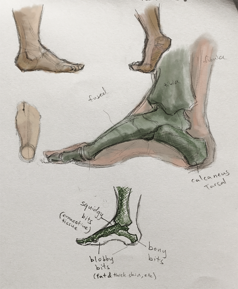
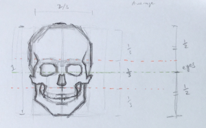
  • The centreline (of weight distribution?) starts between your two biggest toes and runs down to the heel.
  • The bones on the bridge of the foot are actually a bunch of little separate bones but they seem to be fused or something. They’re rigid and don’t really move in relation to each other.
  • So there’re only a few places where things flex an bend. I marked them below as where the colours change.

Footzones

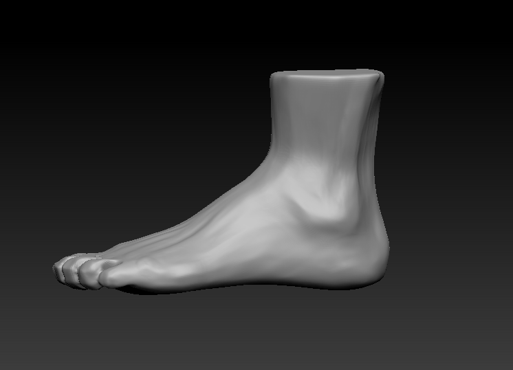
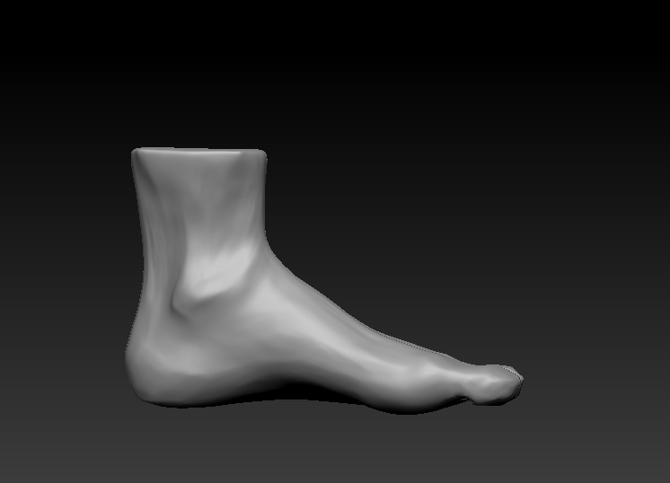
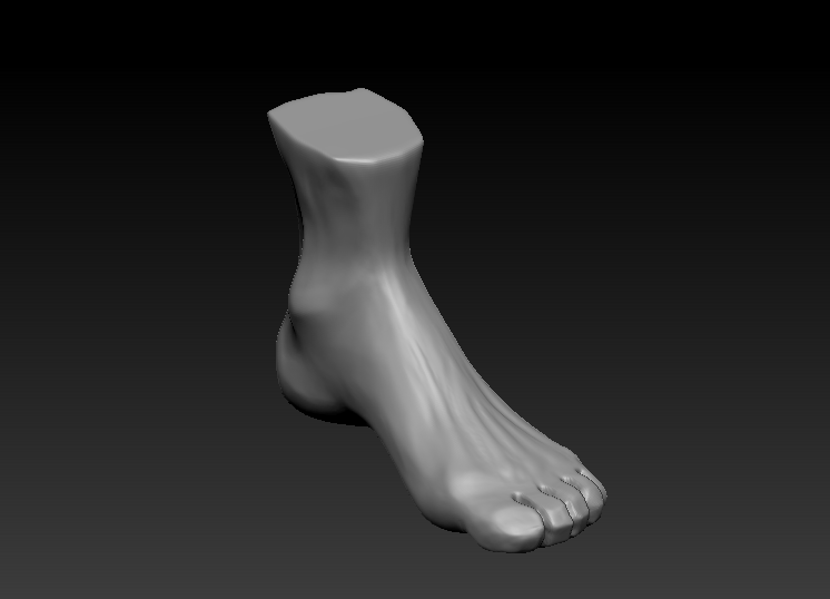
I also modelled a 3D foot as an exercise to really help me understand the form from different angles. It was really useful actually cause it helped me fill in the gaps I’d missed when just sketching in 2D.

Lateral Medial Posterior Anterior

This is how it went from a Maya base model to a zBrush sculpt.

Base Detailed

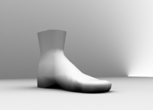
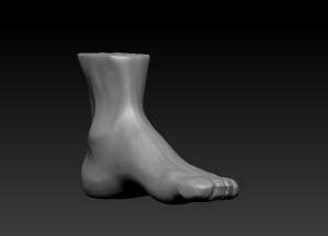
Always easiest to worry about the big shapes first, then drill down into the details. The foot was kind of fun to do cause it’s a simple shape but full of little subtle asymmetries.

It would be fun to go up the leg and do a study on the next connecting limbs. I mean, I’ve also had a pretty bad knee injury before so maybe it’s high time I looked into that area haha. Suppose we shall see.

Thumbnail Studies – Colour

Starting to do some colour studies. I was doing backgrounds for our Regency Love game and I felt like the bit I had most trouble with was working out a good colour pallet. The colours either were a bit too saturated or they started to look muddy when I mixed them too much. Then often I couldn’t get the mood right, like it was too blue/green when it was supposed to have a warm feel.

Hence, thumbnail studies, concentrating on getting the general colour and atmosphere right. Found it quite challenging but useful!

Bierstadt – Praires
Orlovsky – Spring Day Ukraine

1_Thumbnails

The Skull

  • To understand the forms of the face, it helps to understand the underlying structure of the skull.
  • Simplified, it looks like a loaf of bread + a wedge of cheese!
  • The advantage of breaking it down into simple forms is to make it easier to visualise at varying angles.

Skull1

  • Rough guides on average proportions:
    • Eye sockets about the halfway between top and bottom of the head.
    • Eyebrow ridge at the top third.
    • Base of nose at the bottom third.

Skull3 Skull2

  • Most interesting for artists is probably how the forms of the skull relate to the forms of the face.
  • Top half of the face has very little muscle/fat so the form is mostly determined by the bone:
    • The relatively flat expanse of forehead.
    • Eyebrow ridges that shade the eye sockets.
    • The shadowed area between the brows (glabella)
    • On some faces you can see part of the eye socket (usually that inner lower corner has a highlight).
    • The Cheek bones which extend all the way up to the temples. There’s a significant change of plane/light there.
  • The bottom half of the face is a lot more fleshy:
    • The main bony structure visible is the jaw.
    • The rest of the area is softened by fleshy cheeks.
    • The nose is mostly fleshy but should note the bony bridge, especially the little break between where bone ends and cartilage begins.
    • The mouth also follows the shape of the teeth quite closely. (I was so surprised when I saw old photos of my grandpa before he got false teeth, bottom half of his face looked totally different!)

Skull4

Side note: I got this very nice replica skull off ebay. For a plastic skull it’s got a great level of detail and I’ve learnt a lot from being able to refer to it while sketching an actual face. Also being able to hold it and feel all the changing planes from a tactile point of view helps everything sink in.

Skull

Notes on facial features – mouth

  •  Start with the shaped centre-line. (Consistent for all people due to the way lip is formed in pre-natal development)

Lip1

Lip_Lol

  • The centre-line is the darkest part of the mouth.
  • The plains of the upper lip face downwards (in shadow).
  • The plains of the lower lip faces upwards (lit).
  • As you go towards the sides of the lower lip, that dark lip edge gets softer. The lip protrudes but flattens out towards the sides so the shadows are not as strong.

Lip2

  • The teeth/jaw area is actually quite strongly curved (compared to say, the brow area). Take note of this when working with the lip in perspective.

Lip3

Notes on facial features – nose

Mapping:

  • Common beginner oversight: making the nose too long.
  • Usually, the tip of the nose lies halfway between the brows and the chin. There are exceptions but it’s a good idea to do a double check on nose length.

Nose1

  • Helps to start with an oblong sort of shape.
  • There aren’t actually many hard edges on a nose, which is why it’s a bit tricky. You can exaggerate the lines a little to give it a bit more structure.

nose2

  • The end of the nose is a globy sort of protrusion.
  • The nostrils face down so they’re sitting amongst the shadowed areas of the nose. (So they’re actually quite subtle. There is a tendency to make them stand out too much).
  • There is a darker step area between the tip and the nostril highlights.

nose3

  • Something I’ve noticed: I have a tendency to forget perspective and make the nose too wide in 3/4 view.

nose4