Since we started our poison blogs, I’ve been making an effort to gain a level up in visual design skills. One of my bald spots is typography. This is an area I’ve never had any intuition for… As a kid my handwriting was pretty horrid and it hasn’t really improved much since. I think the latent SHAME might be part of the reason I’ve generally avoided thinking about text and form together.
As a step towards rehabilitation 😛 I have been working through Designing with type – The Essential Guide to Typography by Craig, Scala and Bevington. It’s organised like a textbook so it works well as an introduction. I’m only about a quarter of the way through but I feel like it’s time to break things up with a mini project.
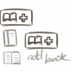
A visual interface for eBooker
This continues from the last post on eBooker UI. eBooker is a project Min’an was working on a some time ago. For more background info see the original post. This isn’t meant to be a pure typography project but hopefully I’ll be able to put some new knowledge to use.
Typography can get overwhelming. There are so many choices with such subtle variations that it’s quite tricky to figure out where to start. Whenever I’ve tried to make font choices in the past I just find myself constantly going back and forth comparing one to another. So to avoid drowning in choices, I’m going to limit myself to considering a few fonts for now. Designing with Type has a Chapter early on about five classic fonts which I’m going to use as an anchor.
Garamond – Old style
Baskerville – Transitional style
Bodoni – Modern style
Century Expanded – Slab serif /Egyptian style
Helvetica – Sans serif style
Each was developed at a different time (Garamond as early as the 1600s) and it’s pretty cool to see how the iconic styles evolved. For example, Garamond was created when the paper and printing technologies were still quite primitive. The strokes are relatively thick and it looks kind of flowy due to its sloping serifs.
In contrast, when Bodoni was created, improved paper and printing technologies meant that there could be more contrast between thick and thin strokes. The resulting look is very sleek and dramatic.
If you’re curious, this article summarises the story of these classic fonts quite well. There is also a neat little eBook on the basics of typography with all the jargon explained in a fun and cheeky way.
The Results
A note on names: I thought it was odd that eBooker sounded more like an app that helps you make bookings than something to do with books. I quite liked Calibre’s name in that it doesn’t have anything to do with books necessarily but it’s still quite memorable and has the right feel to it. So, while doing the designs I also rounded up a few alternative names.
-

- Bodoni
-

- Bodoni
-

- Helvetica, Century, Garamond
-

- Helvetica, Century, Garamond
-

- Mash of everything!
-
- Playing with Icons
-
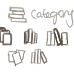
- Playing with Icons 2
Brainstorm results – Type, colour and concepts.


-

- Menu open
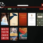
More fleshed out VI designs
The interface was fleshed out using the wireframes from the previous post as a base. I spent most of the time playing with alternative looks and layouts and didn’t get a chance to do a complete set of screens. There are still lots of things bothering me about these attempts but no point being a perfectionist now. Hoping that when I look back on this after a few more months I will be able to see why certain things look a bit off.
I like the dark2 layout the best, I think it’s because it allows me to get more space of books than the rest. Name wise, I agree with you on calibri, I’m not sure why you want to keep the “e” there, feels a little bit old fashion (i.e. we call email “mail” now). Get a different name like.. Bulbabook! jk jk
Hehe, the ‘e’ was more out of respect for the original code name. Was also toying with all these silly ones relating to bookworms as well as some pretentious ones using latin latin latin. I thought I’d refrain from spamming all of theme here though ‘Platipod’ was a favourite. I’m totally sold on Bulbabook though. Perhaps it’s time for a copyright infringing spoof!
When I was picking themes for my blog I came across http://practicaltypography.com/ which seems to have a strong web bent. It doesn’t look as deep as the book you mentioned, but provides some quick and dirty tips.
Love the designs, wish I could come up with stuff like that so quickly 🙁 On typography though, I’m still somewhat skeptical about how much typographical decisions affect the overall design of a site, as opposed to other key elements like colour choices and any motifs used. Maybe it’s got to do with there being typographic elements in the book covers themselves for this particular scenario?
+1 for dark2 and +1 for freedom of naming 😉
I actually prefer Dark1, possibly because the categories stand out more, plus if you add more categories, you won’t run out of space 🙂
Another link/useful resource: http://www.thinkingwithtype.com/
@Min’an: I remember reading articles where typography can potentially make a significant difference to the mood of the page. Not only the type face itself, but the spacing, kerning, line-height etc can alter your first impression of a website/magazine etc. Can’t remember where I read it, but if I find the link, shall pass it on to you.
@Peggy that would be awesome, do let me know if you find it! Thanks 🙂