Tools for the designer

Something I’ve learnt from the Unity community: Don’t build a game. Instead build a tasty platter of tools for a game designer.

Even in a small team, where you’re wearing both designer and developer hats, it’s helpful to have that split between activities. When you’re creating the tools, you want to focus on building something sturdy and extensible. On the other hand, when you’re designing a game, you want to be free to just try things out, make changes quickly, and focus on crafting an experience for the player.

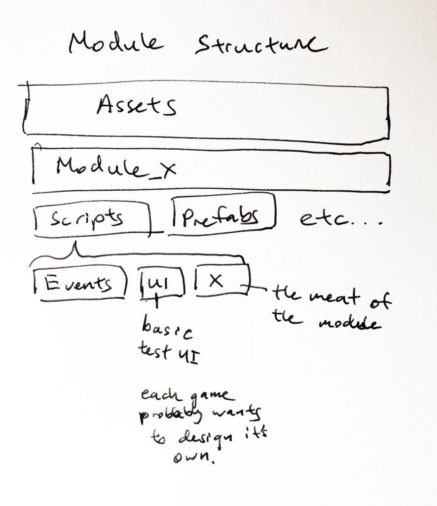
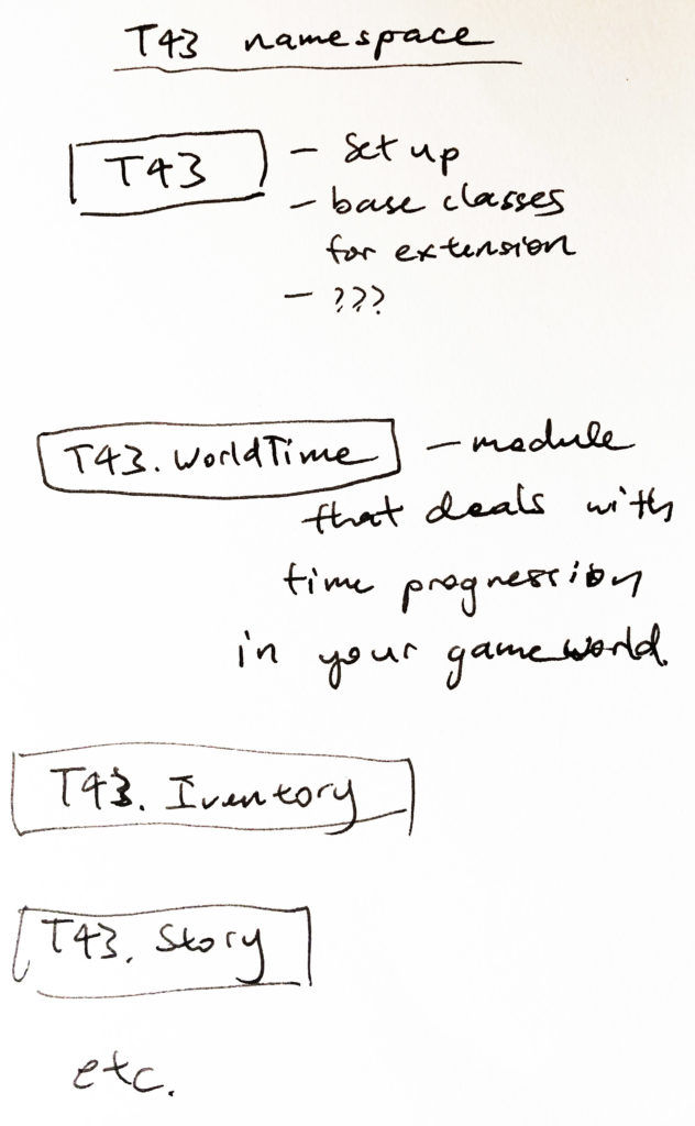
I’m currently trying to take this approach, building small modules that can be plugged together easily. It’s great for motivation and general sanity (especially when you’re working in fits and starts). So far, I’ve started building a few small modules like a calendar, day cycle tracker, inventory, story/dialog, plant growth simulator etc. From this, I’ve started to gain a feel for how to structure and combine the modules. Leaving some notes here about the thought process so far:

Scene management

When learning a new system, I often get paralysed by thoughts about architecture and best practices. It’s a challenge not to fall into the over engineering hole. I’m supposed to be throw-away prototyping and dipping my toes in the water! What am I doing with 30 tabs open about modular Monobehaviours, scriptable objects, prefab best practices, the best way to organise your folders, and whether test-driven development is viable for games… Death.

At the beginning of this week, I was planning build a quick and dirty prototype of a plant growing simulator, which I’ve been mocking up on paper. Instead, so far I’ve spent most of the time setting up structures for scene and UI management. It sometimes seems a bit much but I have discovered that it is beneficial for my sanity (and hopefully future efficiency).

So, might as well post a bit about it.

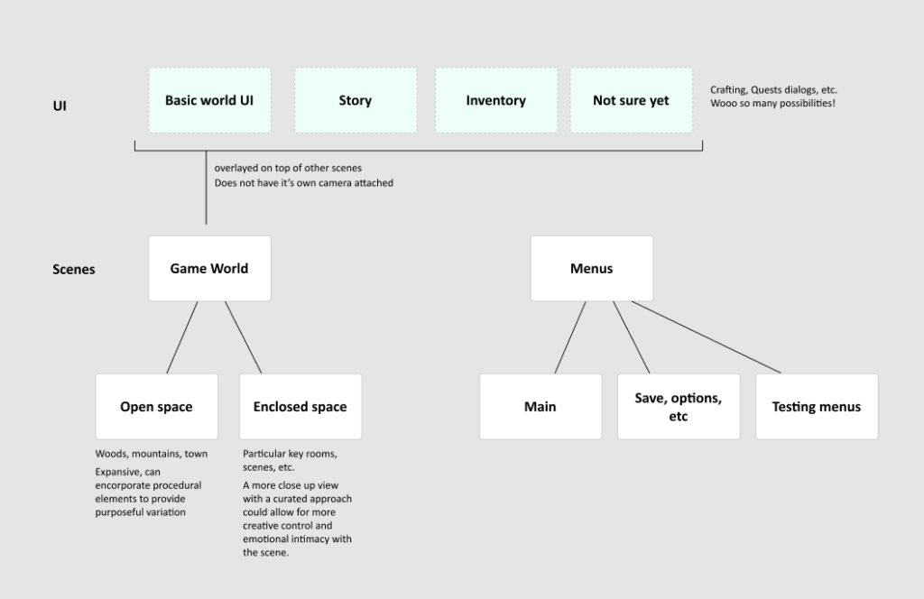
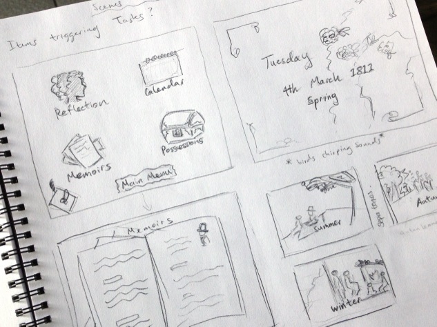
This is what the set up looks like so far. The intention is to structure the scenes in a modular way, especially the UIs so that I can quickly try new scenes and layer them with existing interactive elements. Then, once I build a reusable scene, like a story dialog player, I can put that on top of whatever game world scene I’m currently experimenting with.

Now back to that plant growing simulator…

New journey into Unity

When we created Regency Love, I was most excited about making a deliciously immersive story experience. I wasn’t as concerned about the technology behind it so I decided to use whatever tool was most familiar to me at the time. That’s mostly how Regency Love ended up on iOS. As with all decisions, there were some perks and regrets.

The Apple ecosystem was booming at the time which gave us some good consistent exposure. We managed to attract a wonderful community of players, many of whom finding the game through their love of reading or period drama.

On the other hand, the biggest sadness was how terribly costly / time consuming it would be to port the game to any other platforms. Well, that and the fact that we’ve been wanting to go beyond the visual novel to experiment with more complex game mechanics, something that wasn’t exactly easy on a standard Cocoa development framework.

So, in the meagre amount of time I currently have outside my day job, I have been learning the ropes on Unity engine. I have a bunch of different game ideas I want to prototype, and I’m hoping to post a bit about my progress for reflection purposes. Reflection and a little memory augmentation, considering I will be dipping in and out of these new projects as time permits.

Here’s to learning new things!

Screenshot of Unity workspace.
Screenshot of my current Unity workspace. Lol the bugs…

Feet – bony bits, squidgy bits, blobby bits

A while ago I strained this muscle in my foot. It wasn’t one of those sudden, unbearable injuries. Instead, it was the kind that stuck around and crept up on you every time you worked your body a little harder than usual.

After ignoring it for months, I finally waddled to the physio and through the physio sessions, actually learnt quite a bit about how feet are very expressive of other things going on in the body. For instance, every time I tried to balance in a difficult position, my toes would panic and grab at floor. Also, learnt how the strain in my foot was connected to calf and butt muscles that were sleeping on the job and not doing their fair share of work. (A lot of injuries are caused by small muscles trying to do the work that big muscles are supposed to do. Another interesting discussion altogether).

In any case, it just got me thinking about how neglected feet are in general. Many people don’t give them much thought and some (like my friend from work) find them positively ugly. They get the shapeless blob treatment in art work quite a bit as well.

So I took the opportunity while rehab-ing to do a little study and observation, trying to understand something about the structure as well as the aesthetics of feet. 

Bits and bobs I found interesting:

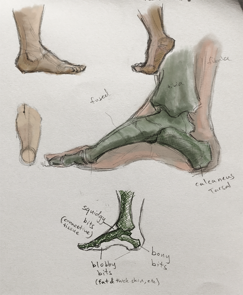
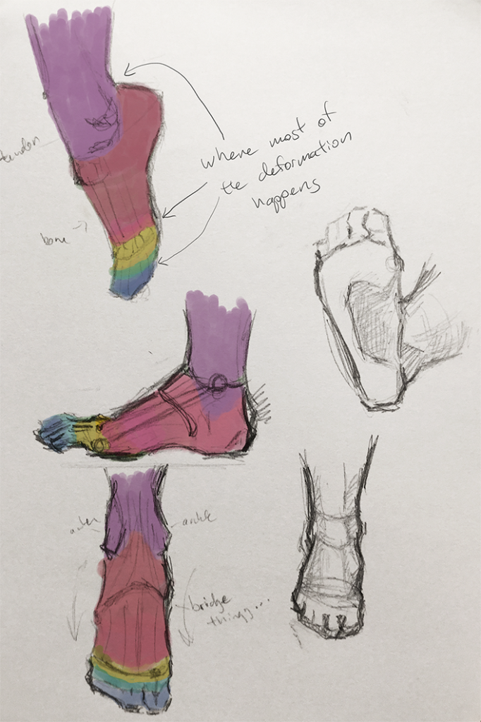
  • The arch of the feet almost reminds me of a slingshot. There’s the heel bone on one side and the toe bones on the other side and this springy line of muscle spanning them.
  • I’m purposely avoiding the medical terms cause I find inventing your own words for things makes it more memorable and fun (though squidgy bits, bony bits and blobby bits might be pushing it a bit).

Foot_1

  • The centreline (of weight distribution?) starts between your two biggest toes and runs down to the heel.
  • The bones on the bridge of the foot are actually a bunch of little separate bones but they seem to be fused or something. They’re rigid and don’t really move in relation to each other.
  • So there’re only a few places where things flex an bend. I marked them below as where the colours change.

Footzones

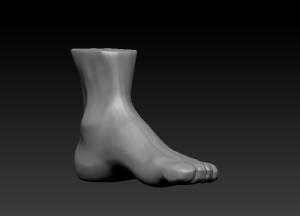
I also modelled a 3D foot as an exercise to really help me understand the form from different angles. It was really useful actually cause it helped me fill in the gaps I’d missed when just sketching in 2D.

Lateral Medial Posterior Anterior

This is how it went from a Maya base model to a zBrush sculpt.

Base Detailed

Always easiest to worry about the big shapes first, then drill down into the details. The foot was kind of fun to do cause it’s a simple shape but full of little subtle asymmetries.

It would be fun to go up the leg and do a study on the next connecting limbs. I mean, I’ve also had a pretty bad knee injury before so maybe it’s high time I looked into that area haha. Suppose we shall see.

Project Sanctuary – looking back

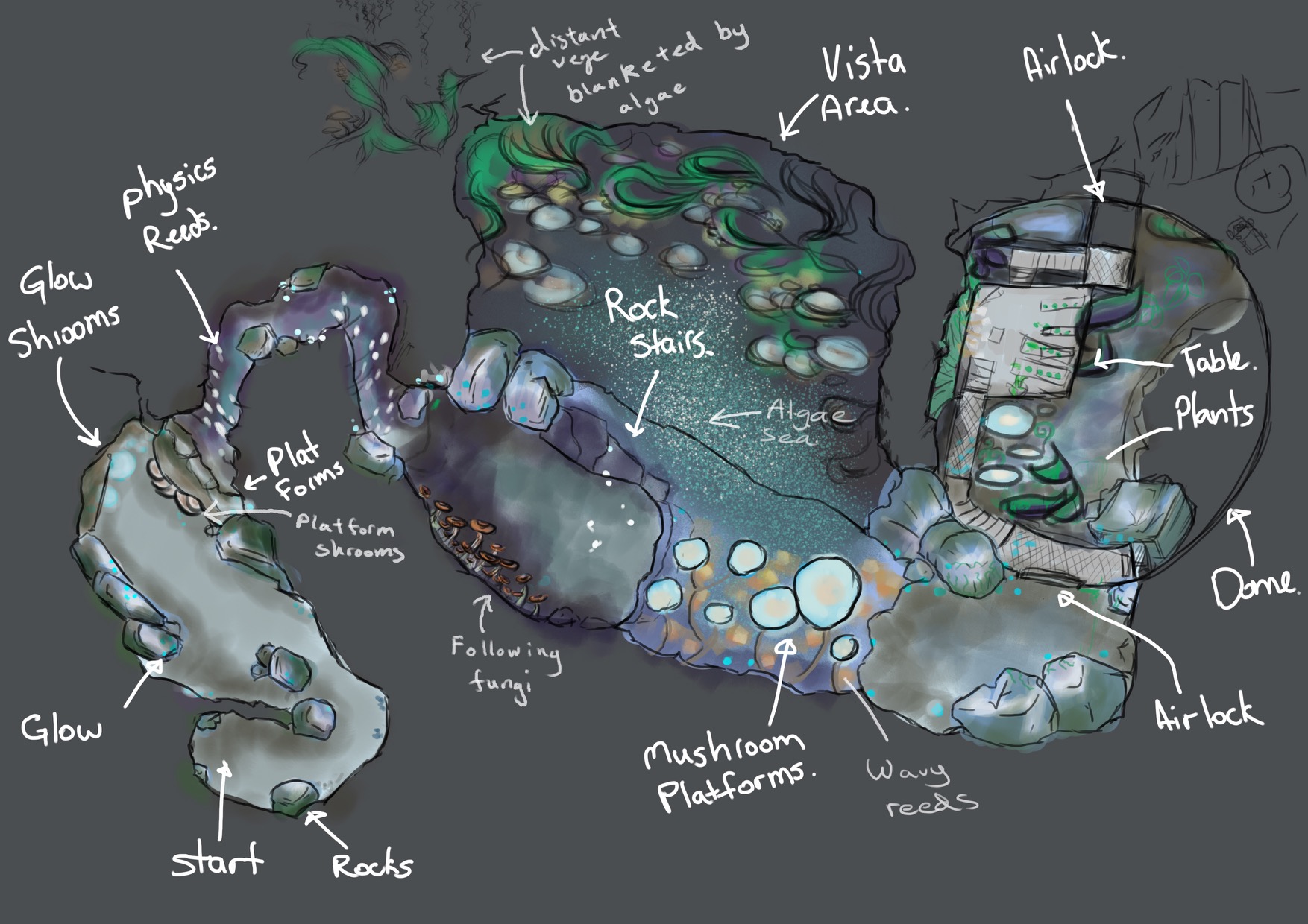
Towards the end of the year, our team of four spent about six weeks of our student lives turning this:

level_topdown

An orthographic (top-down diagram) of the level – one aspect of the concepting process.

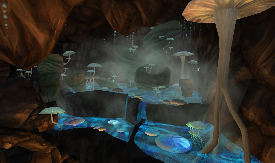
Into this:


Work in progress

How the scene developed as we gradually refined our assets.

BlockingOut1

Initial block out

BlockingOut2

Experimenting with some of the shaders/textures

BlockingOut3

Testing out the lighting

BlockingOut4

There’s a bit of a jump here where we finalised the textures and refined the lighting. We also added in some atmospheric effects like fog and smoke particles.


A closer look at some of the assets.

Brief thoughts on things learnt:

  • A major limitation of that orthographic reference is the lack of height info. Climbing and dropping through an environment makes a level much more interesting and dynamic. We had to use a grey box model and concept sketches to flesh out that aspect of the design.
  • In a game environment where we have to be stingy about how much data we expect the system to process, the models themselves can be very low in detail and still look great as long as the silhouetted shape looks right against the background. In this case it’s the texture and lighting that makes the most impact on how a scene looks.
  • Textures and lighting go together. It’s pretty hard to test one without the other. Some times it feels a little bit like a chicken and egg situation so a good approach seems to be to test early and often (like with so many other things!)


See more on Behance

Lighting and Compositing

Rendered in Arnold, composited in Nuke.

Interesting that the ambient occlusion pass made the biggest difference to how well the bicycle nestles into the scene. Next time I would probably deal with the shadows separately to the rest of the object. I was trying too hard to get extra shadow on an already shaded area and ended up overblowing the specular highlights. Had a lot of fun with the atmospheric effects, volumetric scattering is beeaautiful.

Converting to mini posts! Otherwise it’s never going to happen T___T

These posts are getting ridiculously long! Every time I attempt to write something it ends up taking the whole day. I’m going to switch tactics for a while and try to keep them under 200 words. That way, I might actually complete a post without trying to answer the meaning of life or tell my life story haha. (Why aren’t I just using tumblr?)

So, for now, let me just pop up any fun little pieces I’ve been working on as well as a few random insights here and there. The posts might not much make sense on their own, but I’m hoping that all those mini posts will eventually add up and reveal a big picture of what I’ve been doing and where I’m headed 🙂 Perhaps it will be a bit more organic than struggling to come up with something profound every time XD

Now then, here is a random animation piece made for college!

3D! A whole new can of worms

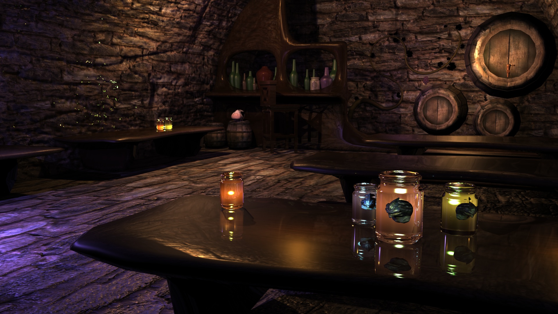
After three weeks at AIE we’ve covered quite a bit of ground. We whizzed through a good block of fundamentals such as modelling, texturing and lighting. Here’s my first attempt at a scene. It’s something of a cross between an apothecary’s cellar and a tavern.

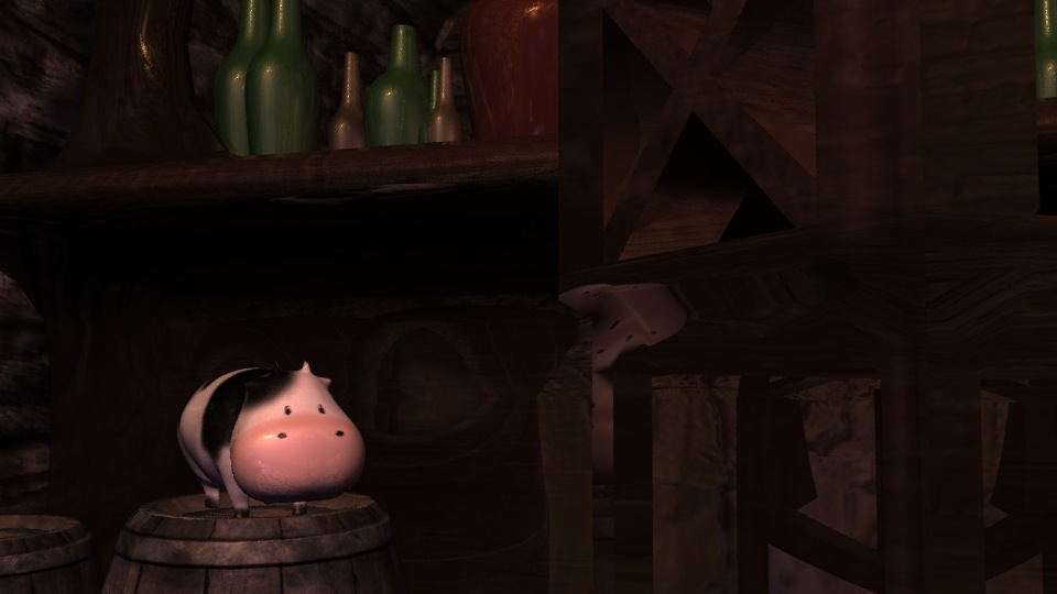
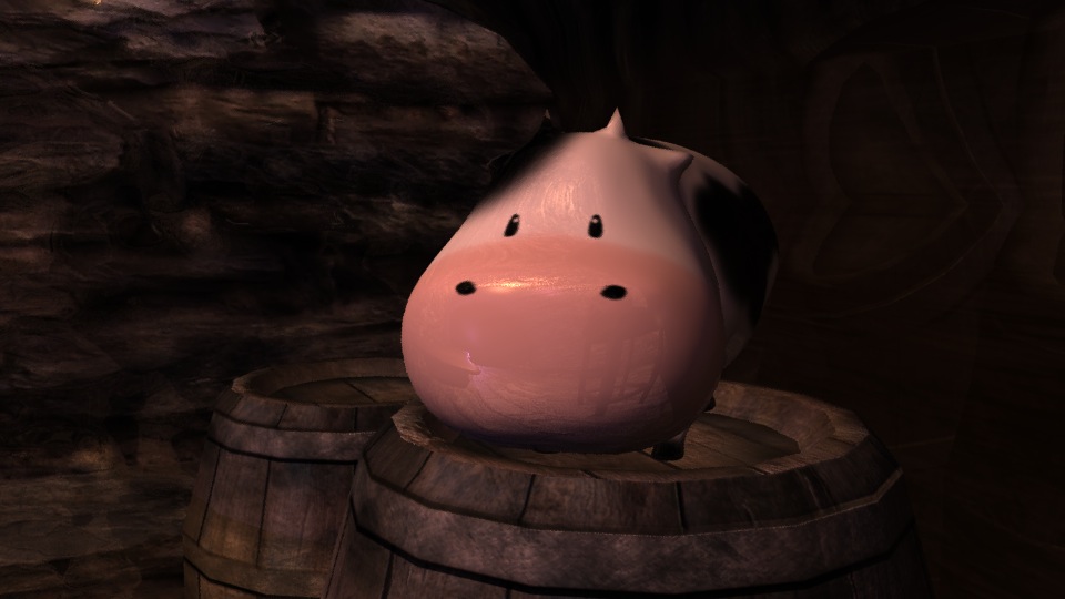
RenderedScene_FinalCow_medCow_closeUp

Look who is trolling the scene. (Mel has been playing too much harvest moon)

Moving On From a Major Project – New Year Plans

Hello, I have been a terrible slacker and deserve to be on the wall of shame. Apologies for halting the chain! I was pretty burnt out after the release of Regency Love and took a proper break to catch up with some very neglected friends and  family. Thank you guys for all of your interest and support! It has really got us through some anxious days.

It’s a new year and I’m at one of those strange junctions in life so I thought I’d share a few thoughts, hopes and apprehensions. 

Currently, my main hang up revolves around whether I want to continue with Regency Love and how much effort do I want to dedicate to it in the coming year? Judging by the reviews and customer comments, we definitely have a good thing going but it’s no where near reaching its potential yet. Despite the overwhelmingly positive feedback, we are having a lot of trouble continuing to promote to our niche audience. Emailing online magazines and blogs is a time consuming and often emotionally draining task. Out writer has been holding the fort admirably on this front but I often feel bad that she’s probably not seeing results to justify her efforts. On the other hand, simpler payed advertising is consistent but terribly inefficient for a low cost mobile game. We have had some success building a following but we have a long way to go in terms of building a sustainable marketing model. 

This in itself would not be a problem for there are many business ideas and directions that we have barely explored. The problem is more a matter of time, commitment and enthusiasm. The project was born from our passion for story telling but now it feels like we’re just doing what needs to be done to get things released. I know it can’t all be fun and games but where do you find the energy to make long term plans when you’re even not sure that people are still enjoying the work? 

Both my colleagues were engaged in formal study while contributing to the game where as I was working on this full-time for almost a year. I felt rather unbalanced by the experience as I wasn’t sure if I was growing or learning much from coding and toying with the game design on my own. At the same time I wasn’t sure how dedicated I could expect my team to be since they all had other commitments. However, I have a history of starting projects that never get finished so I was determined to see this one through.

Now that I have “finished” the project, those fears of loosing steam are starting to be realised. I’m not sure how I want to continue. We are thinking of going on hiatus and placing Tea For Three Studios work on the back bench as something we do for fun. I realise that this may mean Regency Love will never get the exposure it deserves and my colleagues and I may grow apart as a team. On the other hand, perhaps a break is exactly what we need. We can go and grow as individuals while retaining our contact with each other and maybe we’ll regroup at a later time with a bit more experience.

I know many of you guys are trying to create your own products and start your own businesses. What keeps you going on a project? When do you pull away and move on? Do you have any regrets?

My aim for the new year is to grow independently of Tea For Three Studios and be less of a hermit. I am going to go study game art at AIE. I hope to develop some new skills while meeting lots of people in the industry. Peggy and I are going to Game Jam! Another effort to get over introversion and work with cool new people. 

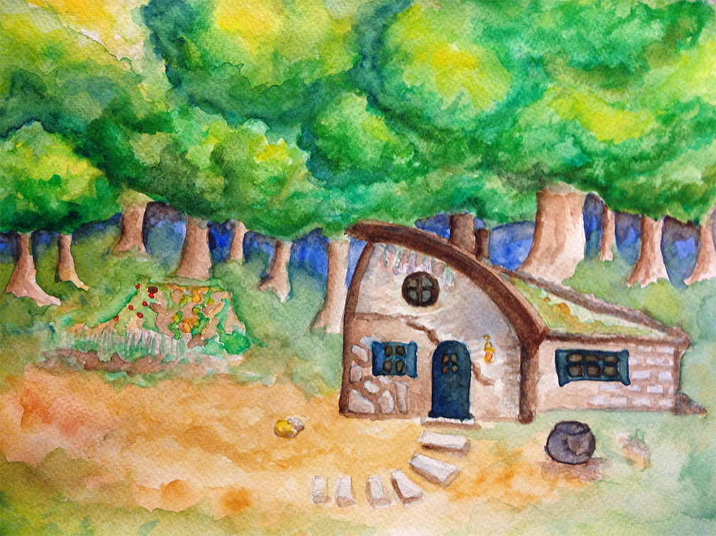
Holiday season: Mel spends time away from the computer. Still messing around with water colours.


Regency Love – Sprint to Release

Hello guys, this poison post is going to be a shameless plug.

I have been trying to use these poison post deadlines as a motivator for exploring things that are not directly relevant “work”. However, these past few weeks I really have been head-down working on Regency Love with little time for anything else constructive (procrastinating and floundering not counting as constructive!). Since the project has played a really big part in shaping my learning as well as my sleeping patterns this past year, I thought it only fair to tell a short story about it.
Early Regency Love Concepts

Early regency love concepts

Regency Love is a romance game inspired by the novels of Jane Austen. The project has been incubating, evolving, hibernating and reviving for the better part of two years now. It started off as a hopeful collaboration between a writer, artist and programmer who were obsessed with Dragon Age, not because of the dramatic battle scenarios or nifty tech trees, but because of the romance-able party members. We wanted to make a game with romance at its core.

Period romances have always been popular in movies and TV dramas but never so much in games. We were very taken with the idea of creating an interactive experience, centred around life as a Regency lady, Jane Austen style. We were also somewhat confident that we would have an audience who felt the same.

So, with little experience and a lot of blind determination, we muddled our way through, doing what we could with game design, development and marketing. We’ve actually started to get the hang of some things, like running play-tests. Gathering busy volunteers, getting their feedback in time for next sprint and wading through Apple’s provisioning admin procedures were some of the things we didn’t even know would be hard until we tried to do it. Between TestFlight, Wufoo forms, and a dropbox full of pre-prepared instruction and thank you emails, running our last play test was almost painless.

Still, this is only the beginning. We will be releasing the game in a month or so and I am hoping we won’t loose steam after the initial release for that would be cutting the journey short. After all that research on app store marketing and hoarding of potential PR contacts, we’re finally going to get the chance to try things out for ourselves. It will be interesting to see what works for us. Many of you have been sending me great articles on related games and app store strategies. I really appreciate it, thanks very much for all the leads.

Follow us at Tea For Three Studios if you’re curious. We could certainly do with your support. If you know of anyone who might be interested in this genre of gaming please pass the word on.