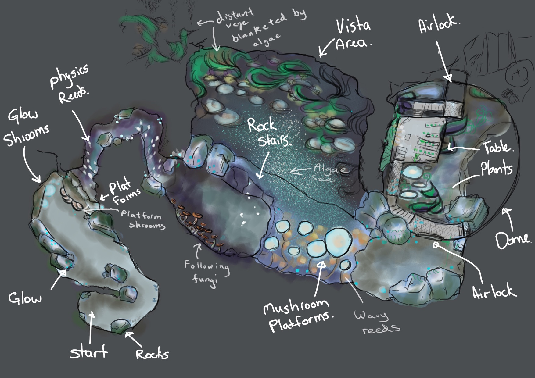
Towards the end of the year, our team of four spent about six weeks of our student lives turning this:
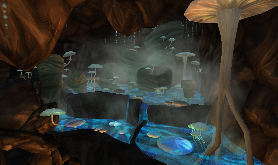
Into this:
Work in progress
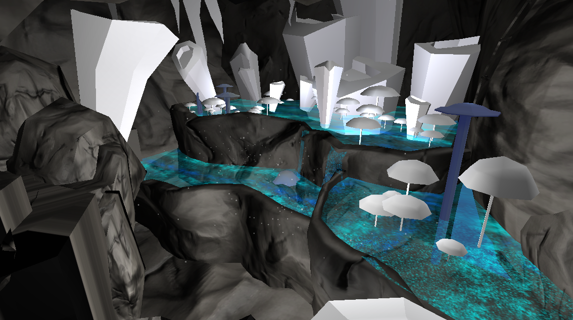
How the scene developed as we gradually refined our assets.

There’s a bit of a jump here where we finalised the textures and refined the lighting. We also added in some atmospheric effects like fog and smoke particles.
A closer look at some of the assets.
Brief thoughts on things learnt:
- A major limitation of that orthographic reference is the lack of height info. Climbing and dropping through an environment makes a level much more interesting and dynamic. We had to use a grey box model and concept sketches to flesh out that aspect of the design.
- In a game environment where we have to be stingy about how much data we expect the system to process, the models themselves can be very low in detail and still look great as long as the silhouetted shape looks right against the background. In this case it’s the texture and lighting that makes the most impact on how a scene looks.
- Textures and lighting go together. It’s pretty hard to test one without the other. Some times it feels a little bit like a chicken and egg situation so a good approach seems to be to test early and often (like with so many other things!)
See more on Behance


