Thumbnail Studies – Colour

Starting to do some colour studies. I was doing backgrounds for our Regency Love game and I felt like the bit I had most trouble with was working out a good colour pallet. The colours either were a bit too saturated or they started to look muddy when I mixed them too much. Then often I couldn’t get the mood right, like it was too blue/green when it was supposed to have a warm feel.

Hence, thumbnail studies, concentrating on getting the general colour and atmosphere right. Found it quite challenging but useful!

Bierstadt – Praires
Orlovsky – Spring Day Ukraine

1_Thumbnails

The Skull

  • To understand the forms of the face, it helps to understand the underlying structure of the skull.
  • Simplified, it looks like a loaf of bread + a wedge of cheese!
  • The advantage of breaking it down into simple forms is to make it easier to visualise at varying angles.

Skull1

  • Rough guides on average proportions:
    • Eye sockets about the halfway between top and bottom of the head.
    • Eyebrow ridge at the top third.
    • Base of nose at the bottom third.

Skull3 Skull2

  • Most interesting for artists is probably how the forms of the skull relate to the forms of the face.
  • Top half of the face has very little muscle/fat so the form is mostly determined by the bone:
    • The relatively flat expanse of forehead.
    • Eyebrow ridges that shade the eye sockets.
    • The shadowed area between the brows (glabella)
    • On some faces you can see part of the eye socket (usually that inner lower corner has a highlight).
    • The Cheek bones which extend all the way up to the temples. There’s a significant change of plane/light there.
  • The bottom half of the face is a lot more fleshy:
    • The main bony structure visible is the jaw.
    • The rest of the area is softened by fleshy cheeks.
    • The nose is mostly fleshy but should note the bony bridge, especially the little break between where bone ends and cartilage begins.
    • The mouth also follows the shape of the teeth quite closely. (I was so surprised when I saw old photos of my grandpa before he got false teeth, bottom half of his face looked totally different!)

Skull4

Side note: I got this very nice replica skull off ebay. For a plastic skull it’s got a great level of detail and I’ve learnt a lot from being able to refer to it while sketching an actual face. Also being able to hold it and feel all the changing planes from a tactile point of view helps everything sink in.

Skull

Notes on facial features – mouth

  •  Start with the shaped centre-line. (Consistent for all people due to the way lip is formed in pre-natal development)

Lip1

Lip_Lol

  • The centre-line is the darkest part of the mouth.
  • The plains of the upper lip face downwards (in shadow).
  • The plains of the lower lip faces upwards (lit).
  • As you go towards the sides of the lower lip, that dark lip edge gets softer. The lip protrudes but flattens out towards the sides so the shadows are not as strong.

Lip2

  • The teeth/jaw area is actually quite strongly curved (compared to say, the brow area). Take note of this when working with the lip in perspective.

Lip3

Notes on facial features – nose

Mapping:

  • Common beginner oversight: making the nose too long.
  • Usually, the tip of the nose lies halfway between the brows and the chin. There are exceptions but it’s a good idea to do a double check on nose length.

Nose1

  • Helps to start with an oblong sort of shape.
  • There aren’t actually many hard edges on a nose, which is why it’s a bit tricky. You can exaggerate the lines a little to give it a bit more structure.

nose2

  • The end of the nose is a globy sort of protrusion.
  • The nostrils face down so they’re sitting amongst the shadowed areas of the nose. (So they’re actually quite subtle. There is a tendency to make them stand out too much).
  • There is a darker step area between the tip and the nostril highlights.

nose3

  • Something I’ve noticed: I have a tendency to forget perspective and make the nose too wide in 3/4 view.

nose4

Notes on facial features – eyes

  • The eye sits in its socket held up by various muscles and padded by fat.

Eye2 Eye3

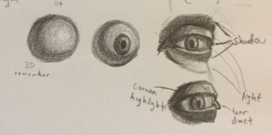
  • It helps to start with the eyeball as a lit sphere (to make sure you’re thinking about it as a 3D structure rather than something flat.)
  • When placing the iris and pupil, take care that they’re in the right perspective.
  • The lids are where a lot of the light and shadow changes happen:
  • The upper lid is kind of opposite to the lower lid in terms of where the light hits.
    1. So while the lash line is dark on the upper lid (due to it facing down), it’s comparatively light on the lower. This is for typical lighting where the light source is coming from above.
    2. Similarly the fleshy bit of the upper lid tends to face the light and is lighter while the lower lid is in shadow.
    3. Then, the surrounding area beyond the lid is again reversed – the area under the brow is shadowed while the area of the upper cheek is lit.

Eye

  • Extra touches: There is a little refracted highlight from the cornea.

Eye4 Cornea

What’s in a face?

I’ve been working through some online portrait drawing classes by Gary Faigin on Craftsy. They are really fantastic. Gary Faigin is a very systematic teacher and I highly recommend the classes for anyone looking for a logical approach to portraits. It’s not about creating the closest copy possible. It has more to do with what we notice as humans when we look at a face. The first course in the series is free, a great intro and quite fun to do.

I’ve been taking notes, just to jot down some of the things I found most useful. Will fill this in eventually. The notes are in scribble form at the moment and I’d like to convert them to something I can still understand months later.


There is also a book: The Artist’s Complete Guide to Facial Expression that I hear is a staple reference for digital artists.

Composition Thumbnails

So following the previous post on composition, I’ve been trying an exercise designed to help you learn more about composition (although after trying it I think I picked up a lot more than just composition). The exercise involves you grabbing a master work that you want to learn from and painting a copy of it. The copy should be small and in black & white to reduce distractions allowing you to concentrate on observing the light values.

It’s amazing how much you can pick up when you’re working hard to replicate an effect as opposed to just admiring it. Also, because you’re replicating, you’re not nearly as distracted by your creative vision as you would be when doing an original work.

1_Boldini_RitrattoDiSuzy 1_Boldoni1_2

2_Sargent_EnglishGentleman 2_Sargent1_3

3_Vemeer_El_astrónomo 3_Vemeer_El_astrónomo_3

5_Sargent_DaughtersBW 4_Sargent_Daughters_3

Gegerfelt_VeniceInTwilight 6_Gegerfelt_VeniceInTwilight_1

7_Sargent_Rosina 7_Sargent_Rosina_1


Still got a long way to go but I’m already feeling the results in the way I approach things.

Notes on Composition

Personal notes after reflecting on lectures from conceptart.org (May add to this later):

Composition is all about creating focus.

Create focus by balancing emphasis & economy

  • What are your points of interest?
  • Points of interest should help the eye move around the canvas. (Feels dynamic, interesting and believable).
  • Levels of Emphasis – Primary, secondary, tertiary…
  • How to direct attention? The presence of contrast strengthens emphasis. Contrasting values, colours, directions, ideas/poses/actions.

If most of the picture is uniform and then you have even a small point of difference, that point of difference is very noticeable. Strong focus point.

Other things that pull emphasis:

  • Social proofing – People in the scene looking in a direction. Faces in general draw attention.
  • Amount of detail, soft and blurry backdrop
  • Front to back?


Rhythm

  • A loose pattern with some uniformity and some chaos. The human perception system is pretty geared towards recognising patterns, it really draws the attention.
  • There can be rhythm in many things: placement, colour, shape. (Think about gestalt principles).

Repetition

  • Works with Rhythm and is a way to introduce more points of interest.

Variety

  • Increases organic feel of the scene. Believability.
  • Or it will feel stagnant, although it will feel stately, controlled and safe? Mechanical…? Or make things feel uncanny and creepy.

Continuity – Implied Lines

  • Draw the eye along implied lines. Diagonals look more dynamic. horizontals look safe.

Balance

  • Balance detail and calmness throughout the painting.
  • Weigh your visual weights. Is your emphasis heavy enough on your areas of interest?
  • If not careful, composition will feel heavy on one side. Or the hierarchy will feel off.
  • Opposing points of interest feels a connection. (could be diagonal, point symmetry).
  • Divide and conquer – Can divide into quadrants or thirds and analyse, is it balanced enough?